Media: Campaign, Print, Video
Year: 2011
Collaborated with Seung-eun Lee
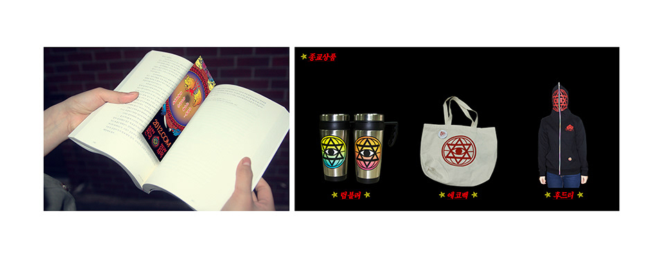
My role: Directing, Video producing, graphic design (poster, promotional goods), illustration
Graphics
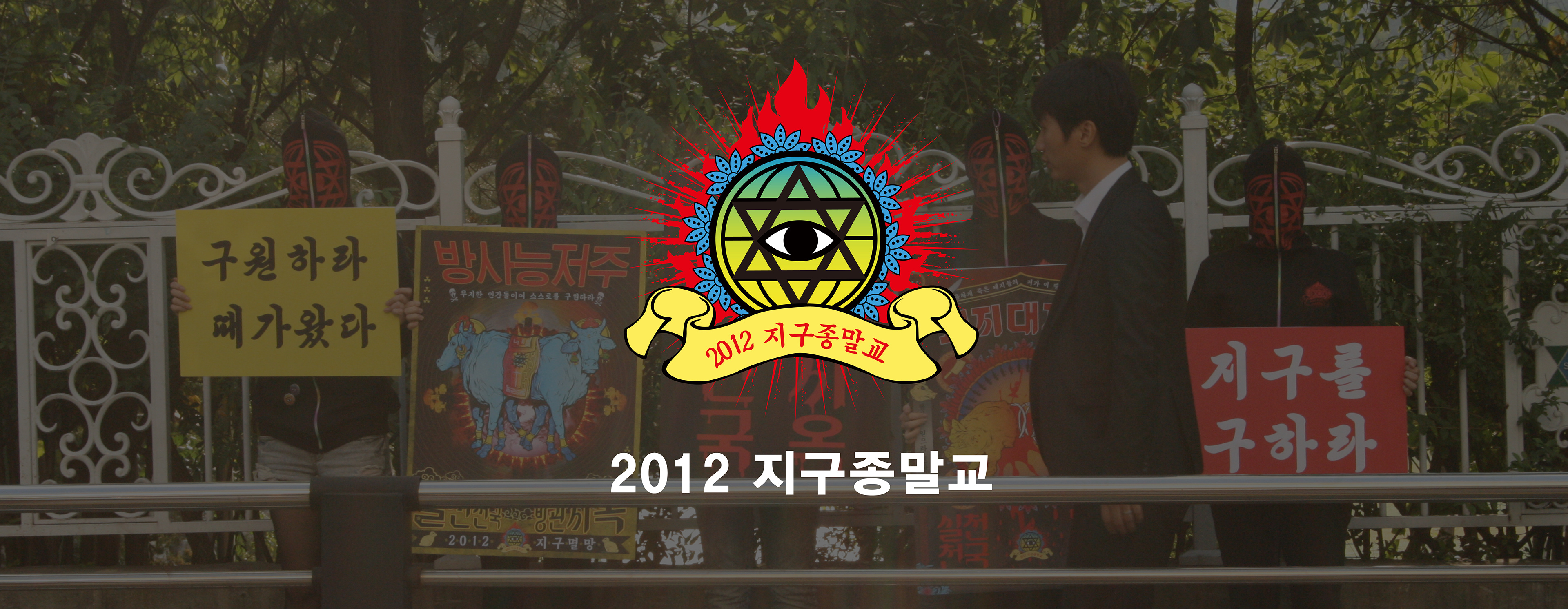
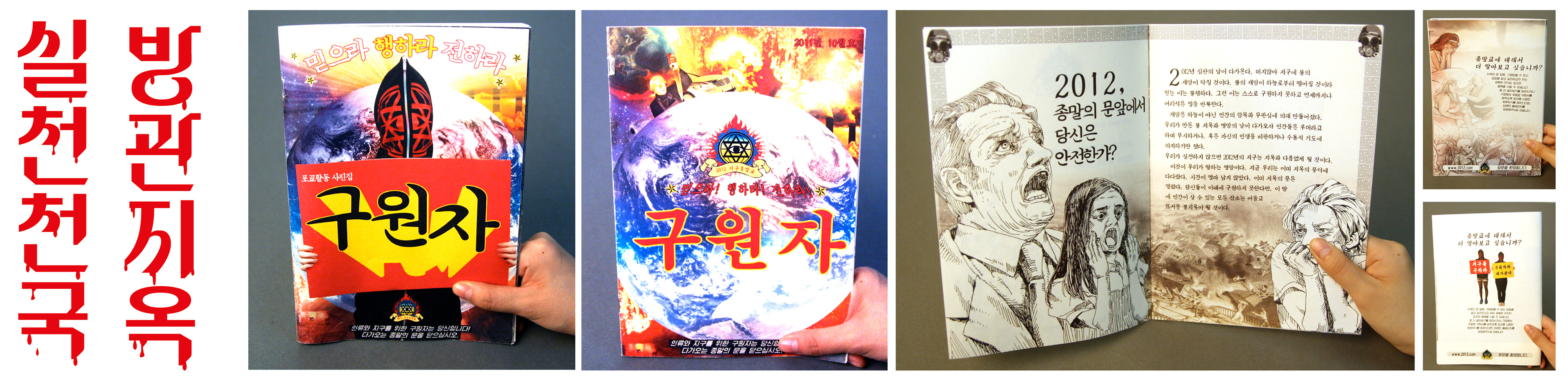
The whole concept started from graphic design.
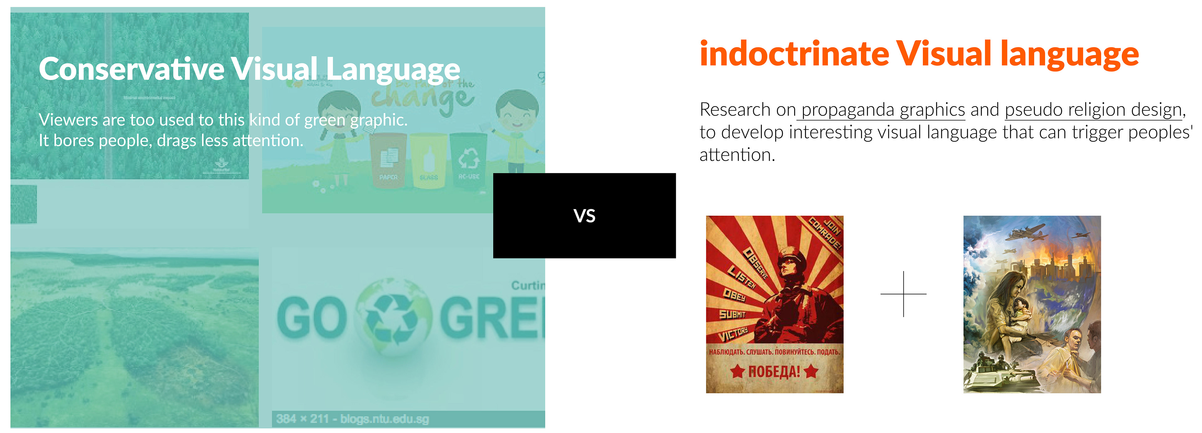
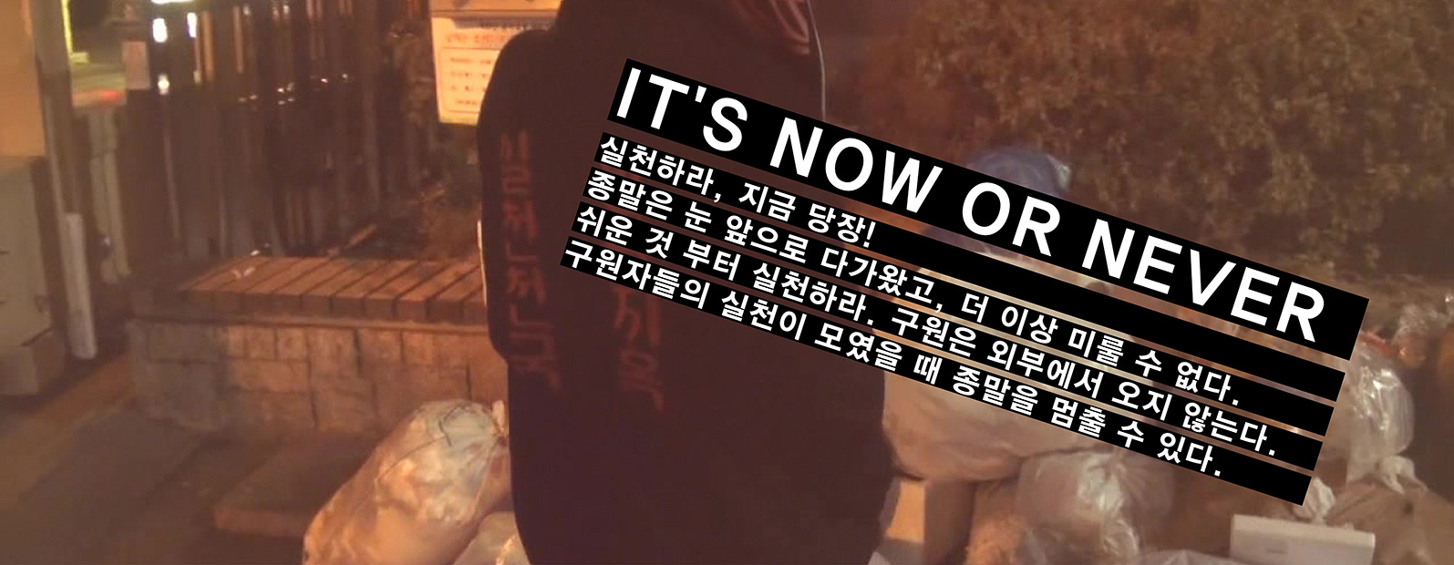
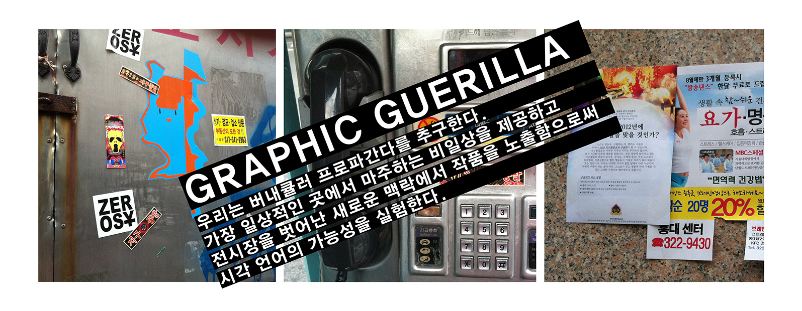
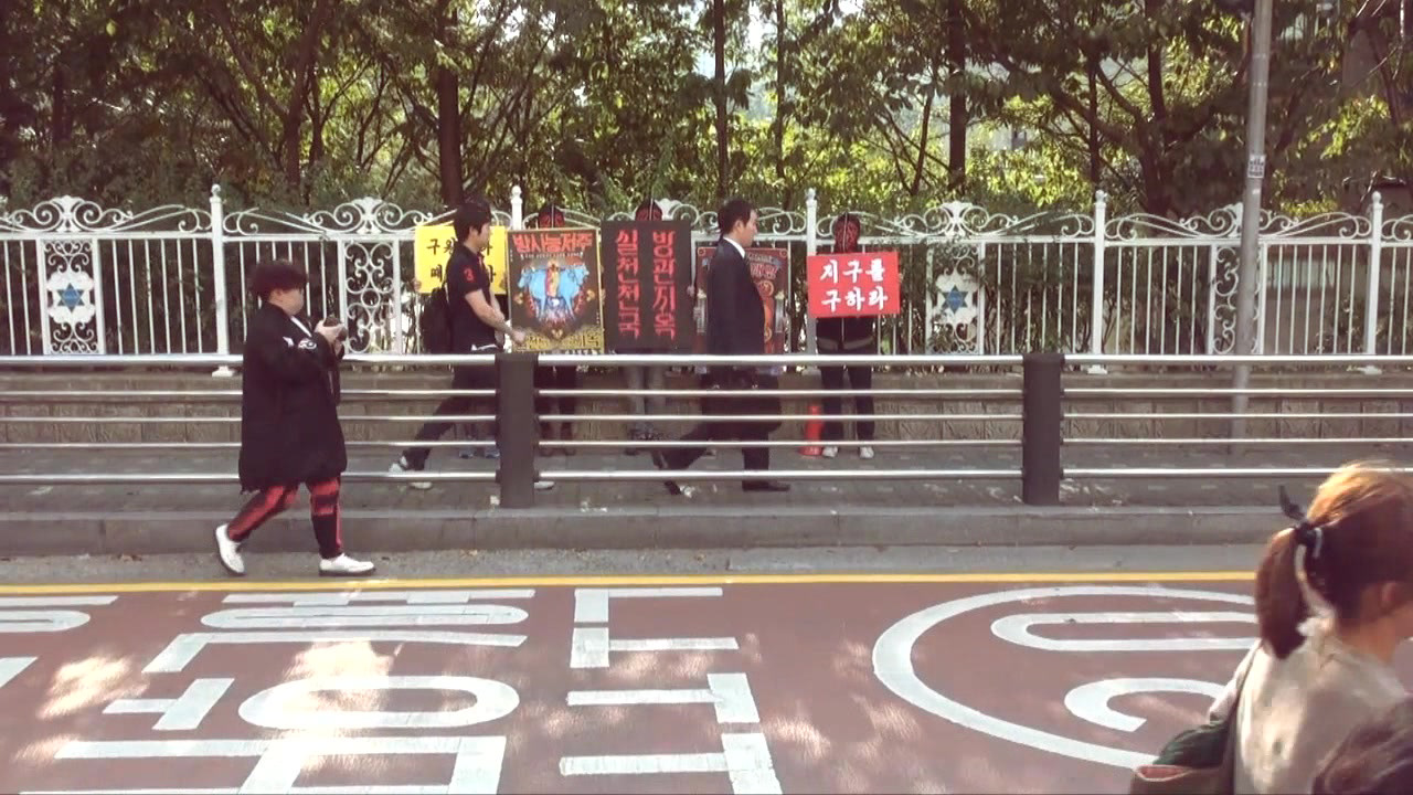
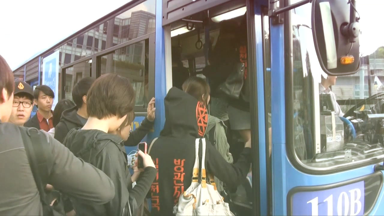
Conservative graphic design of eco campaigns look good, as well as the messages it delivers. So those graphics don’t trigger the interest of people who don’t care about the environmental problem. Our graphic design is mixtures with visual languages of indoctrinating pseudo-religion and propaganda posters.There was a kitsch vernacular graphic design trend in Korea, so we combined them to create this unique visual language.
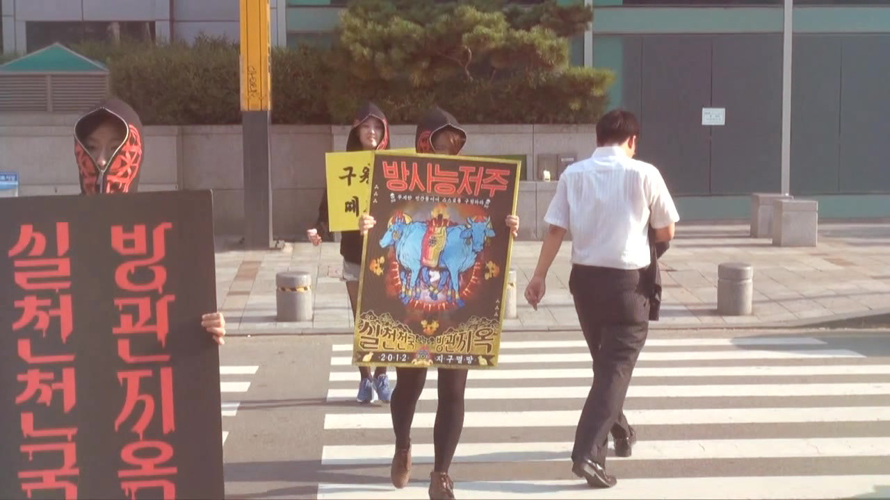
It’s all about talking to a ‘niche market’ within eco-friendly campaigns. So varieties of guerilla campaigns were performed at the same time, with weird but funny taste.
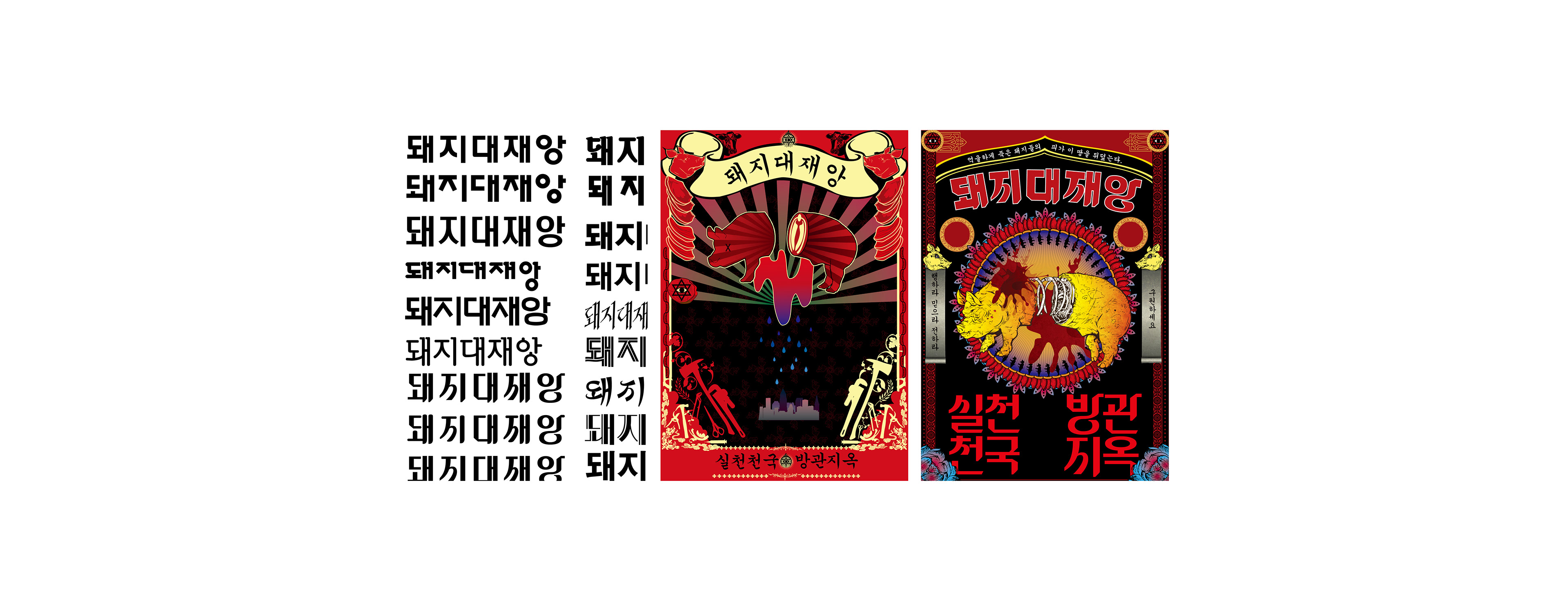
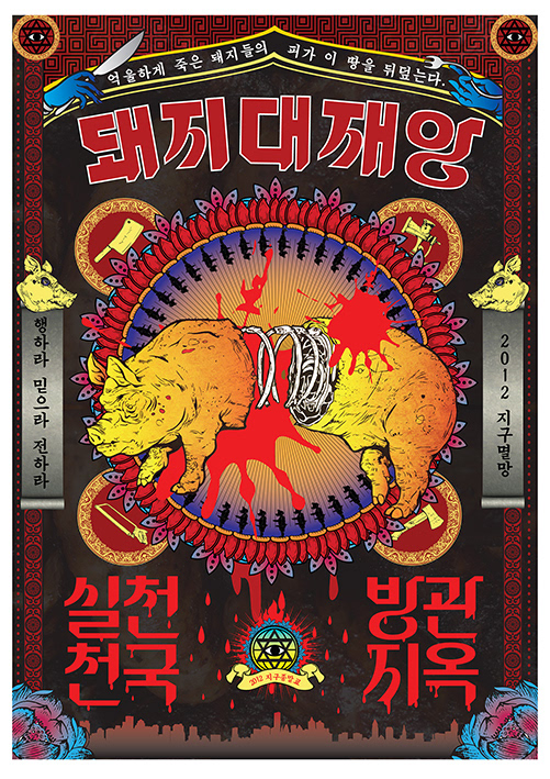
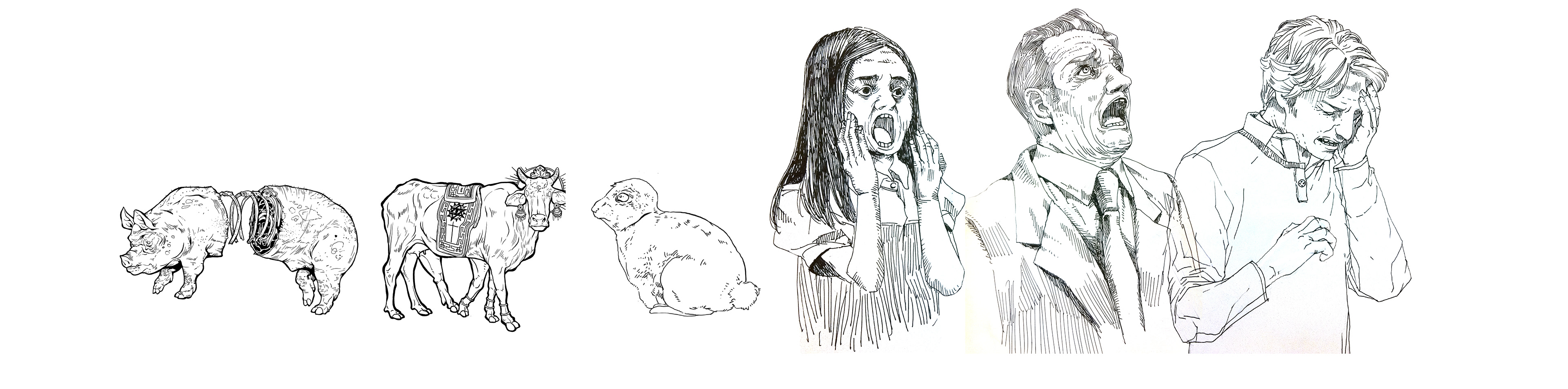
A poster for the carnivorous diet based on cruel treatment towards animals and eco-system
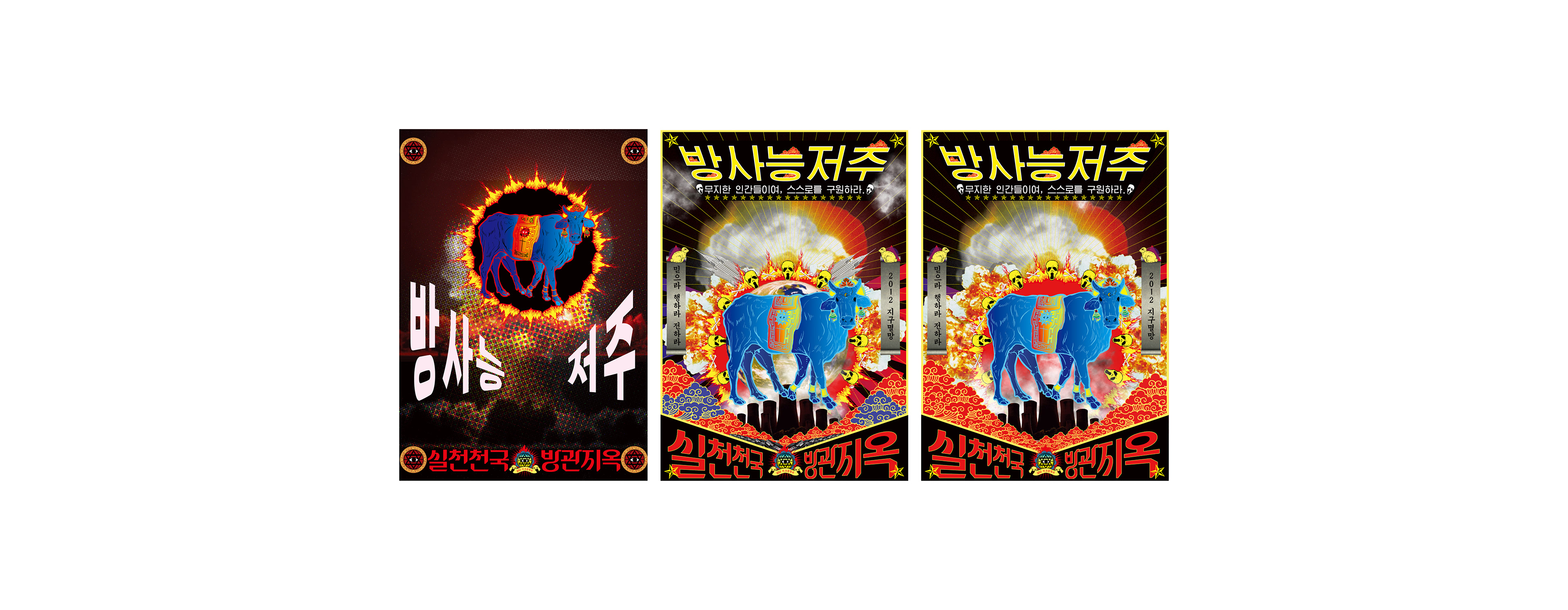
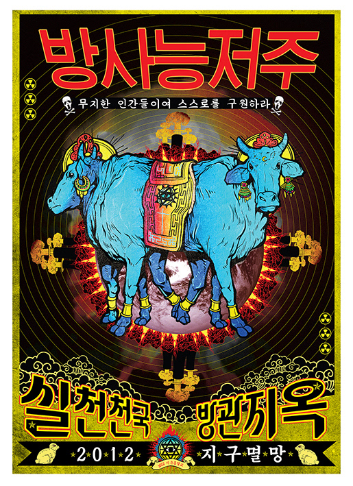
A poster for the energy crisis and nuclear facility disaster
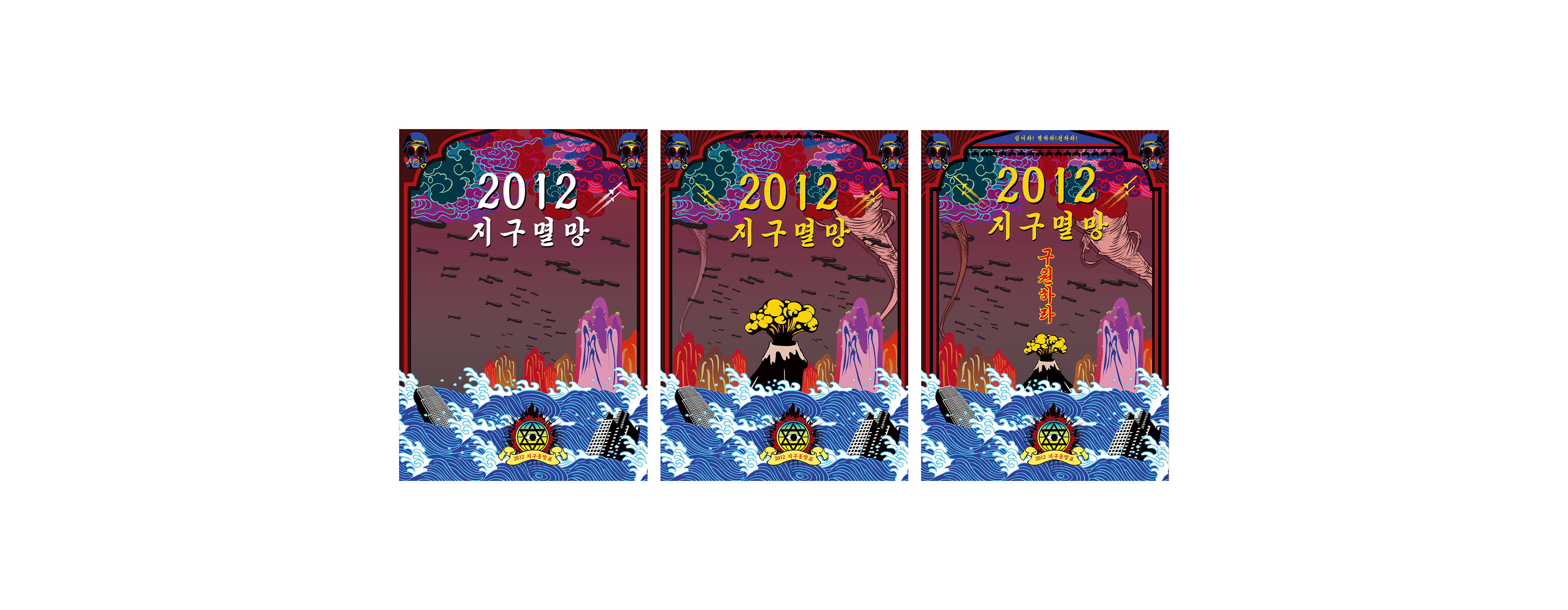
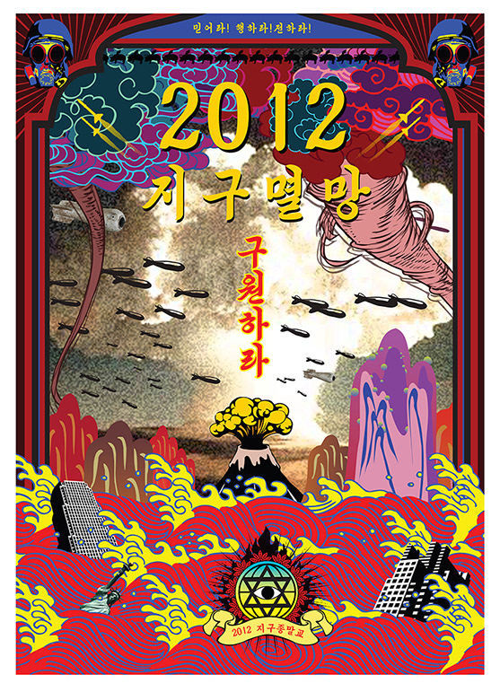
A poster for the whole social / environmental disasters caused from human ignorance and arrogance
Campaign Design


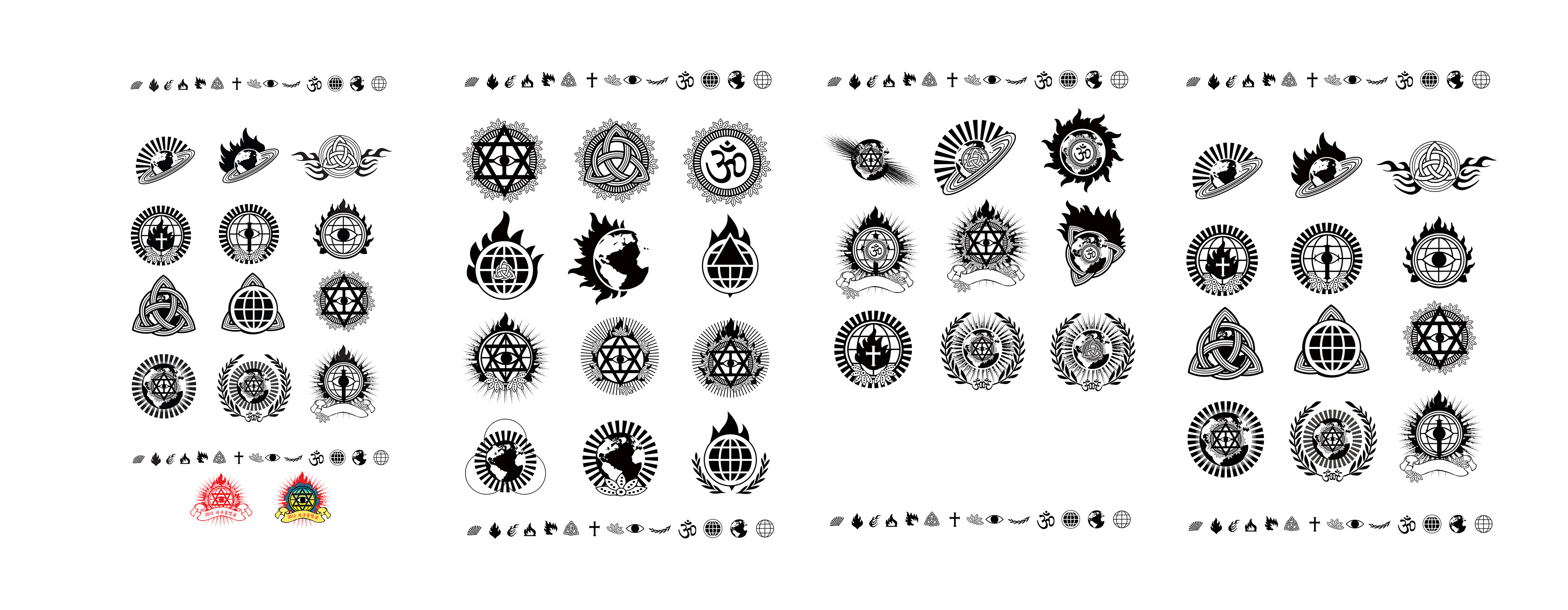
Logo Design
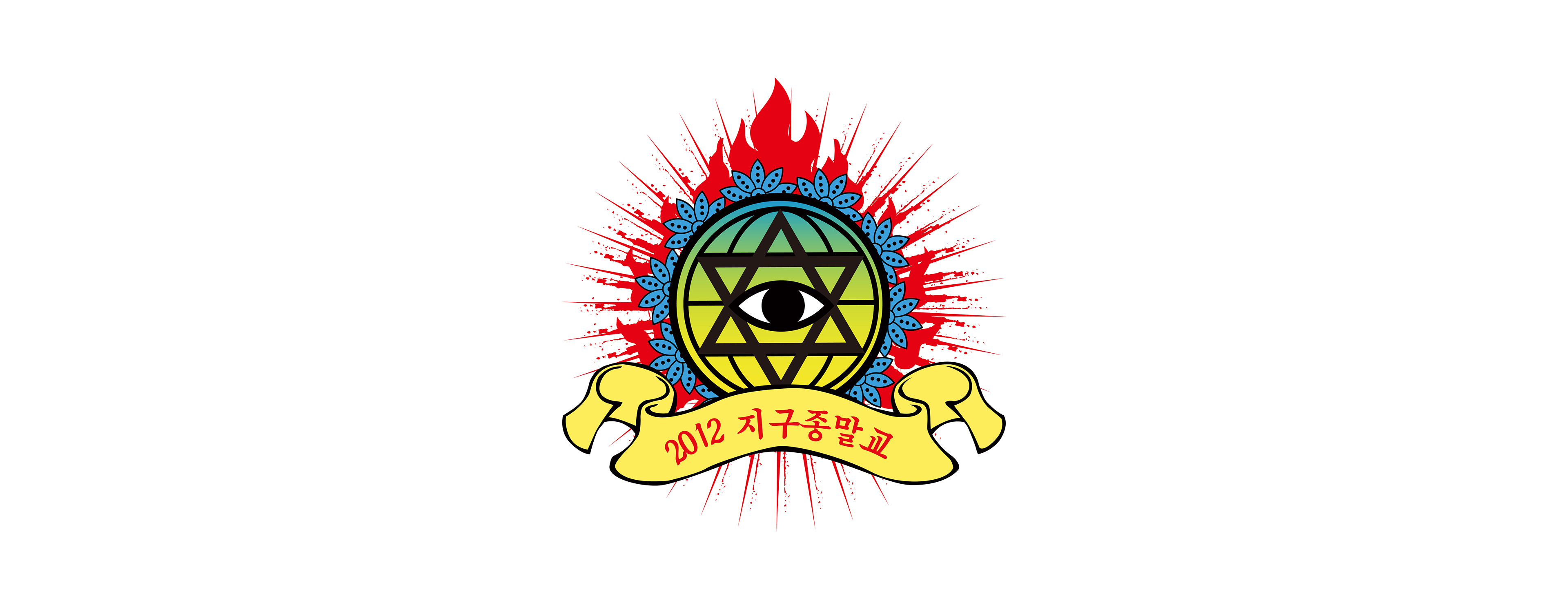
The logo was created with a method.
First we come up with all graphic symbols for ‘the earth’ ‘religion’ ‘apocalypse’ and mix & matched the 3 symbols freely.
Last design was selected for a aesthetic & semantic quality.
Other graphics

Graduation thesis for a Bachelor's degree