MedIa: Digital screen
Year: 2017-
My role: Planning, Service proposal, UX//UI design, contents directing
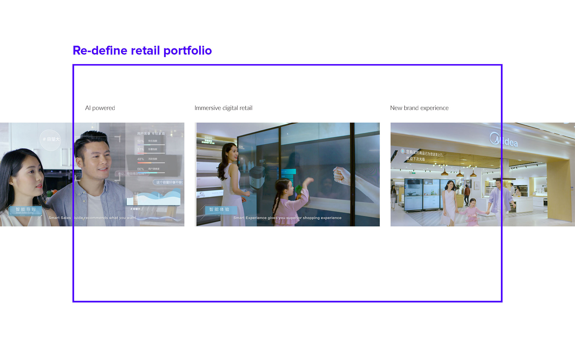
Concept
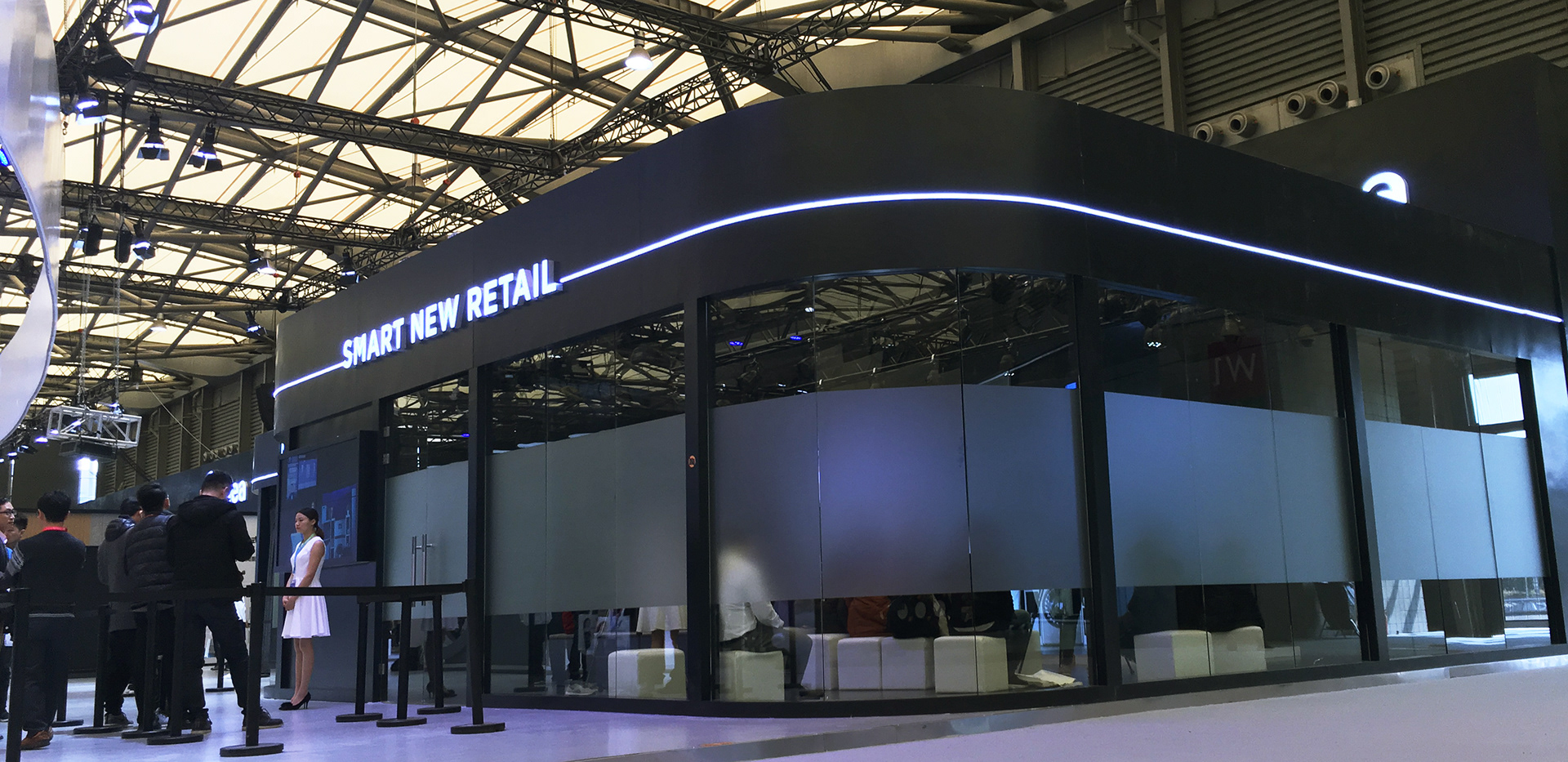
Smart New Retail is Midea's project to combine AI tech to Retail platform.
With Smart New Retail customers can enjoy standardized service quality and up to date information on the spot.
With Smart New Retail customers can enjoy standardized service quality and up to date information on the spot.
Overview
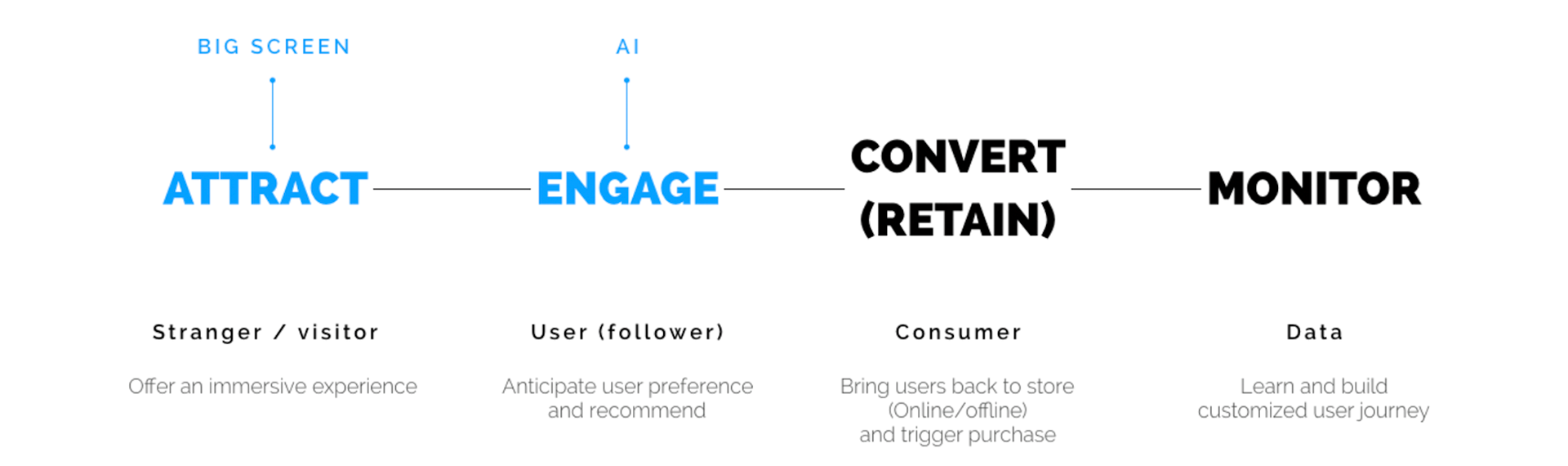
With this platform users will exchange their data for the best choice of product.
Furthermore, business can track what's happening in overall product UX cycle and get a real time insight.
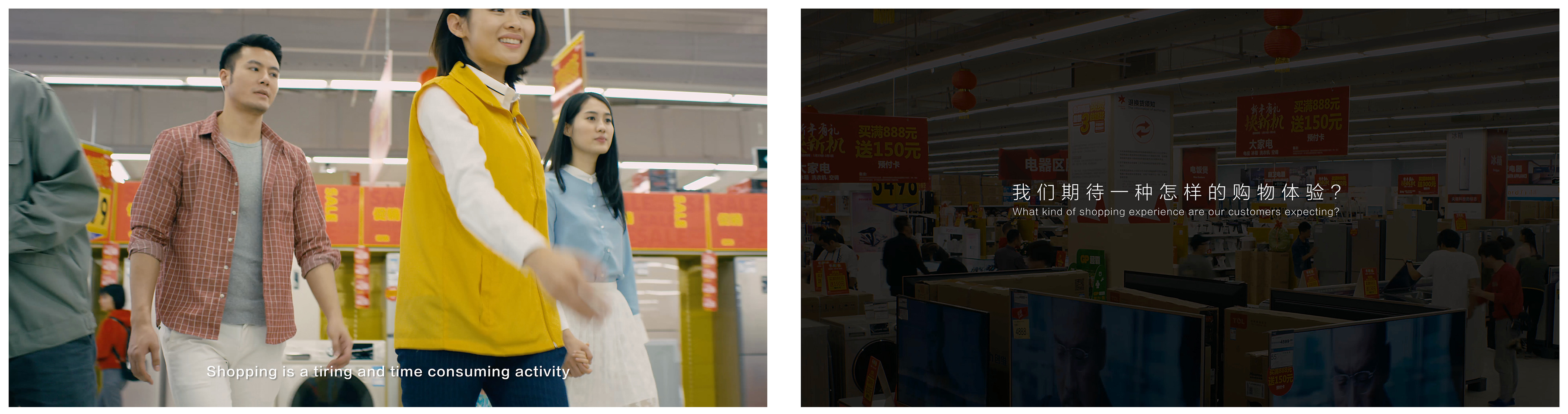
Retail store visiting
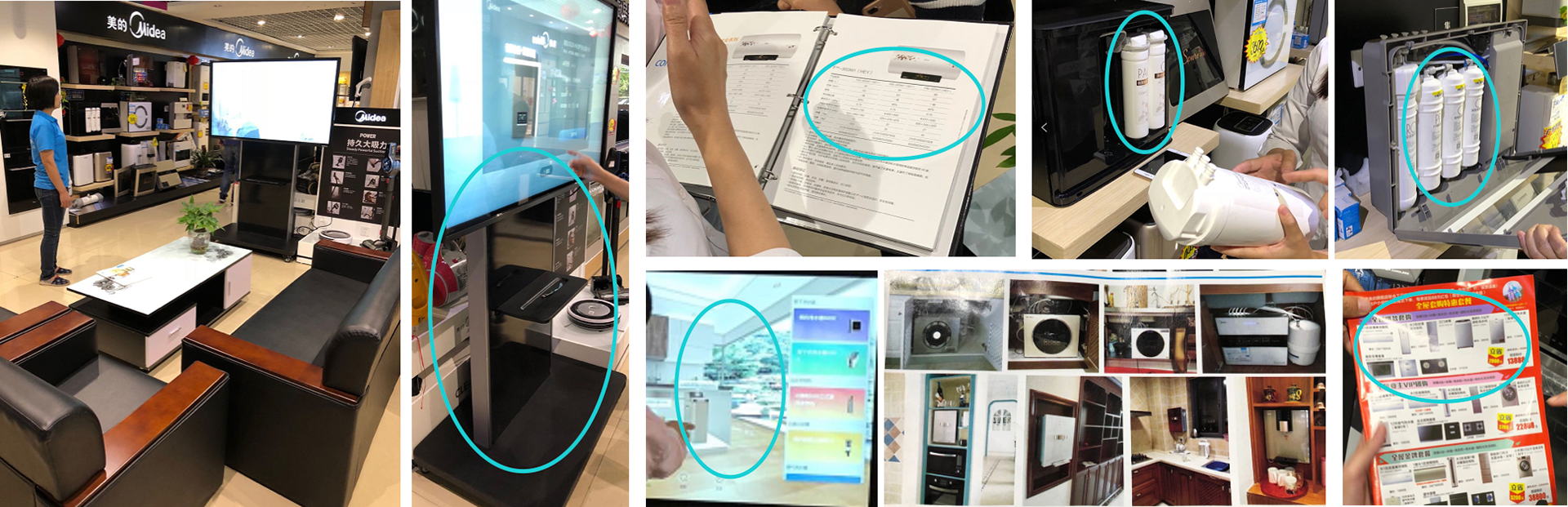
With the research team, we visited local flagship retails stores.
We learned about what's sales person's point of view and what is a practical solution to improve sales results.
We learned about what's sales person's point of view and what is a practical solution to improve sales results.
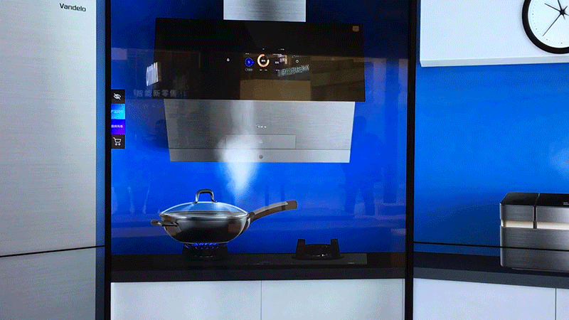
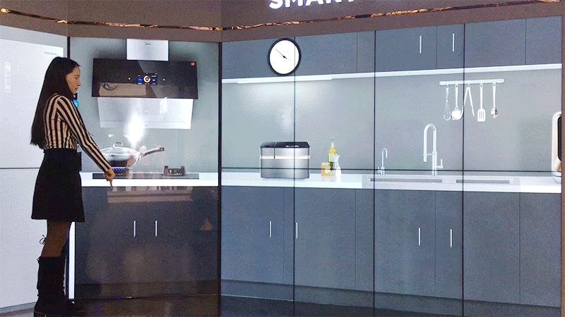
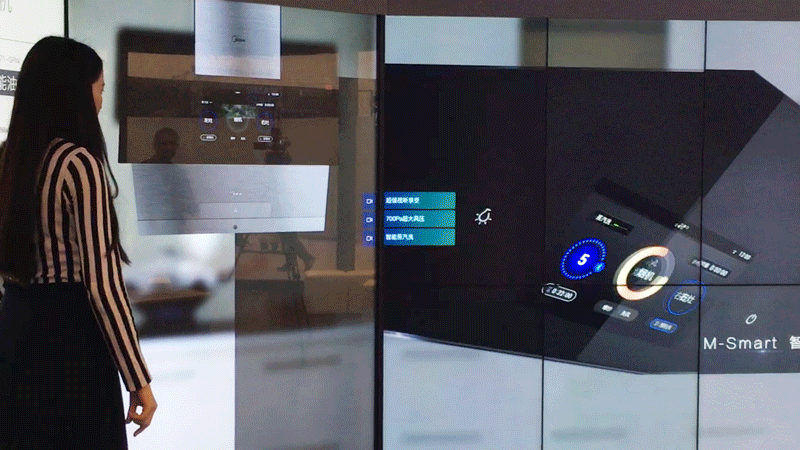
Concept Video
We created this video with a vendor, to communicate the value and potential.
I contributed to writing scenarios and making storyboards.
I contributed to writing scenarios and making storyboards.

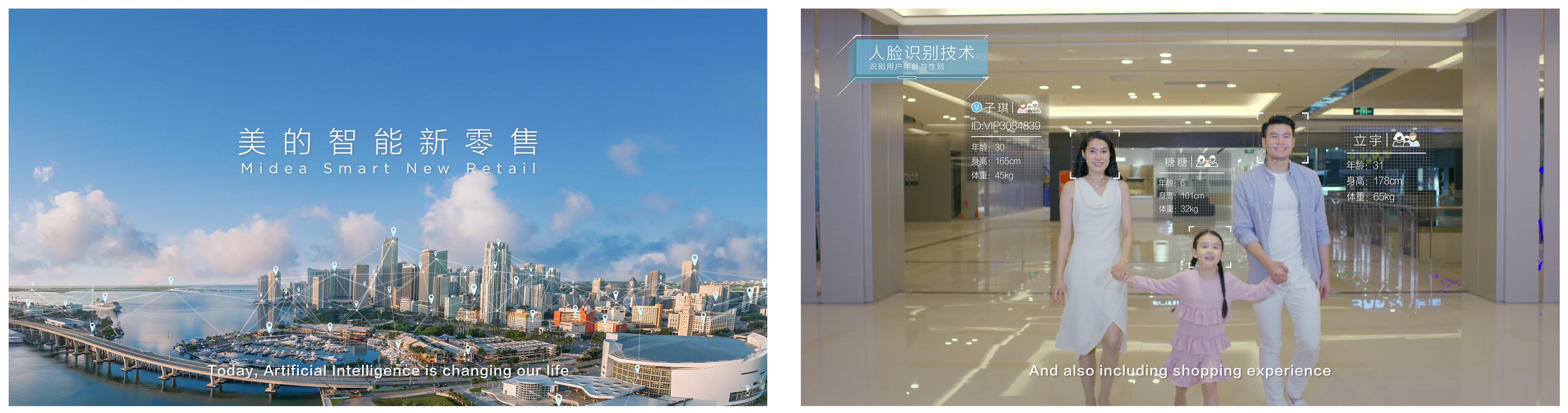
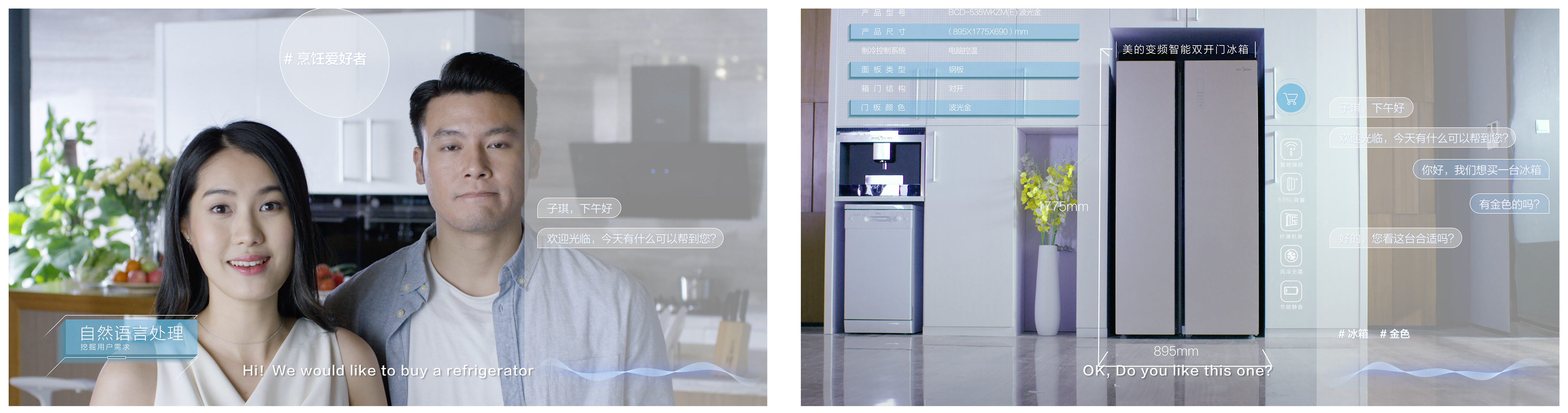

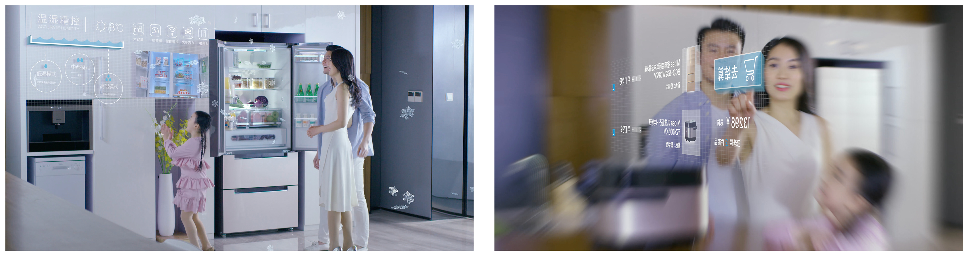
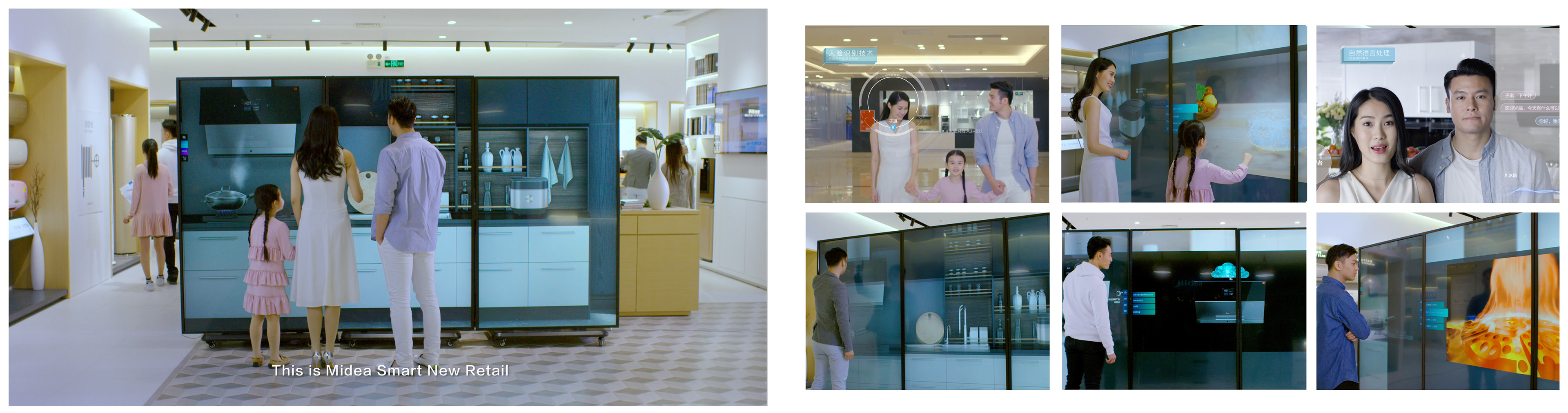
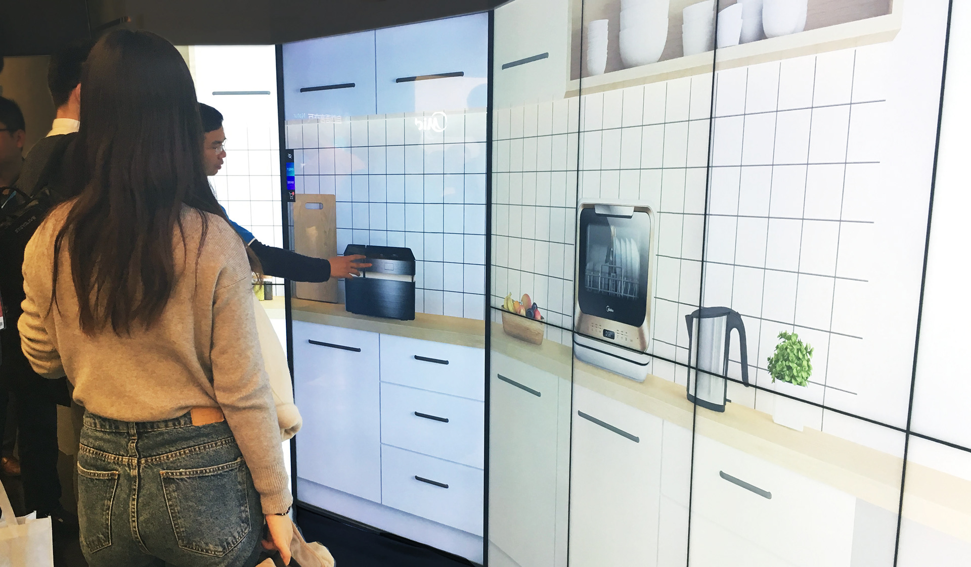
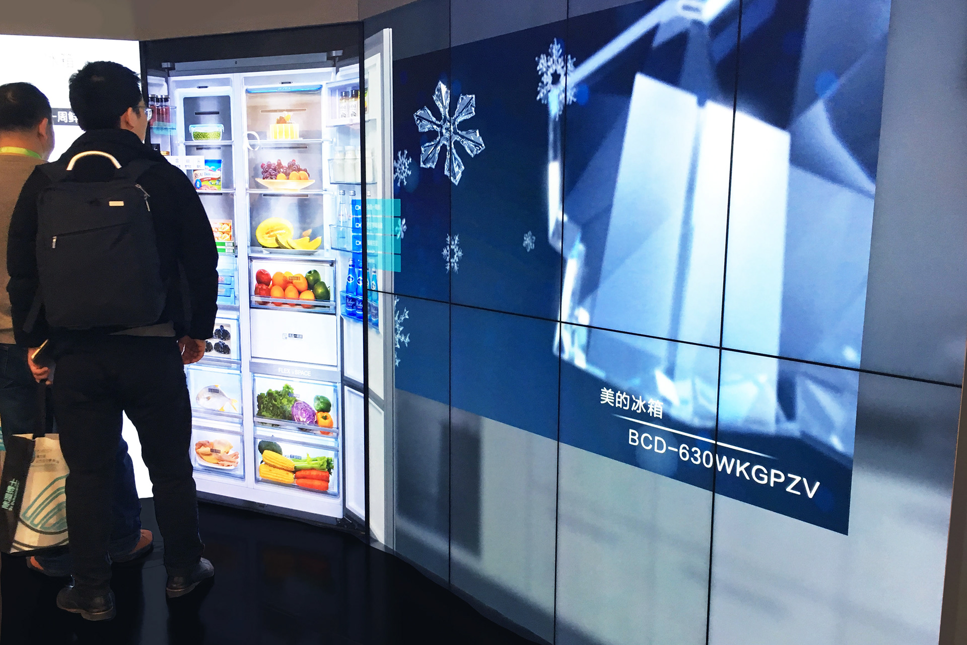
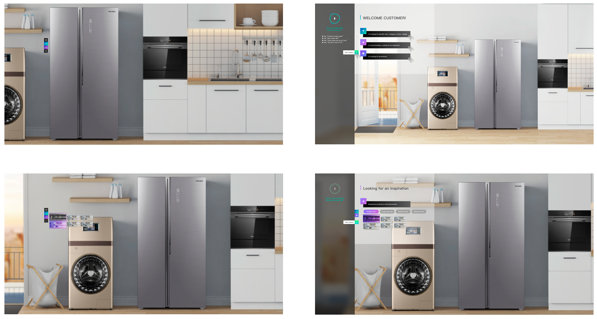
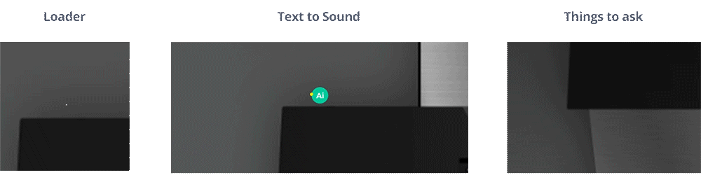
It uses an interactive touchscreen to explore the products in an immersive way.
AI analyze shopper's age and gender and their related shopping pattern.
You can also use human language to ask any questions to find the best product you want.
AI analyze shopper's age and gender and their related shopping pattern.
You can also use human language to ask any questions to find the best product you want.
UX
User journey
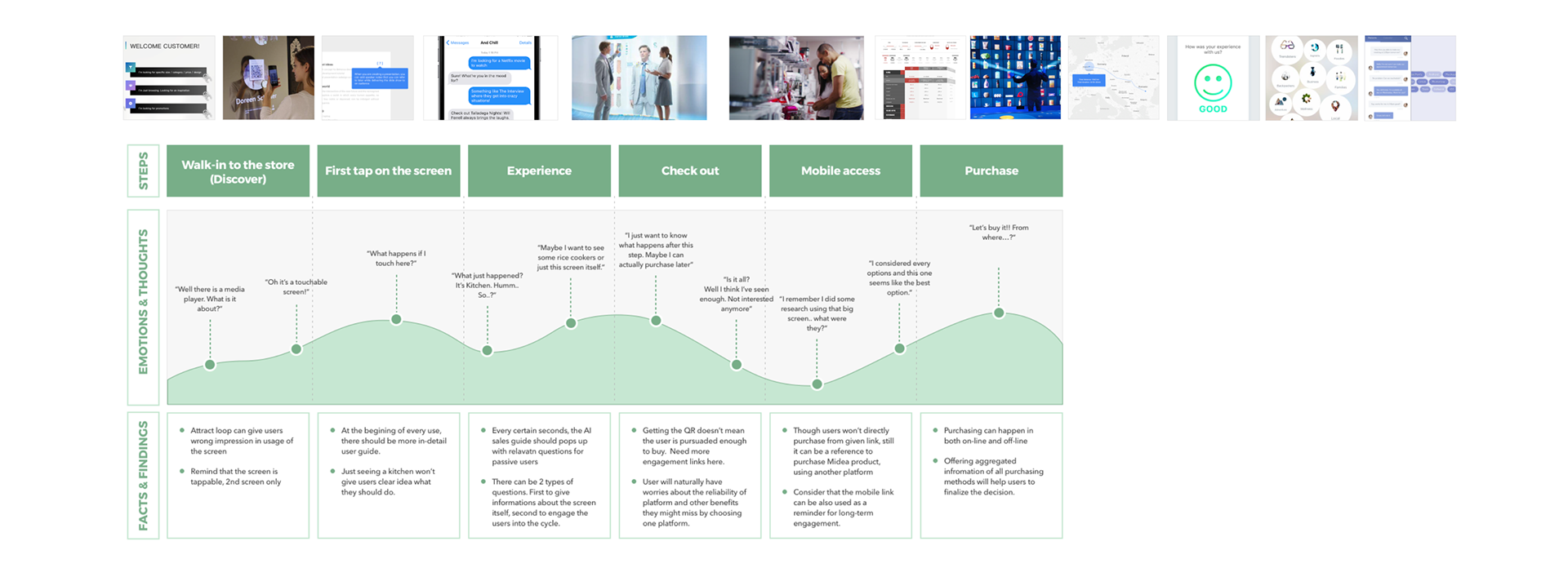
We tried to understand what will happen in a user's emotion and thoughts as they enter the retail shop and face this unaware platform.
Our main focus was to keep the needs satisfied yet downsize overall features.
Our main focus was to keep the needs satisfied yet downsize overall features.
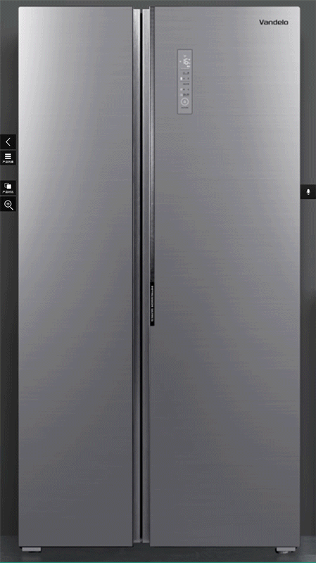
Structure
The screen experience has two interaction touch points.
It helps to keep the screen simple and immersive, while being rich and useful
It helps to keep the screen simple and immersive, while being rich and useful

Some of the features were found useful during user study,
but it was too complicated to address at the first stage.
We considered them as our 2nd stage mission and marked grey.
but it was too complicated to address at the first stage.
We considered them as our 2nd stage mission and marked grey.
AI behaviour guideline
I boiled down all the possible questionnaires to AI, into this one sheet of flow.
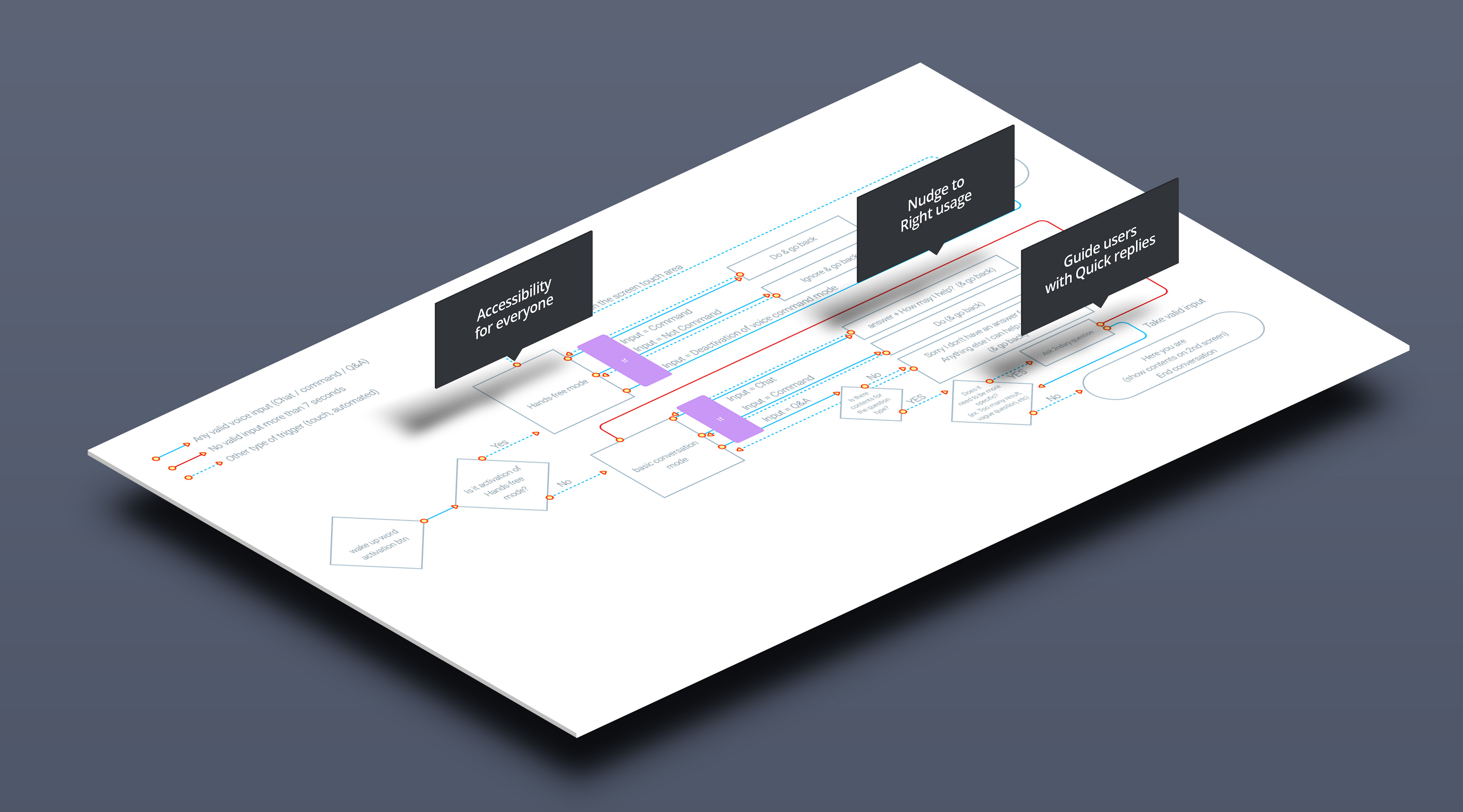
1. Accessibility for everyone (hands-free interaction)
2. Nudge to right use (trained sales behavior)
3. Guide users with quick replies (Curated options to navigate easy & fast)
2. Nudge to right use (trained sales behavior)
3. Guide users with quick replies (Curated options to navigate easy & fast)
In any case of conversation, it is designed to nudge users to right usage, while giving users free of interaction.
Now users can access products not only by following given tracks,
but by asking any human centered questions they prefer.
Now users can access products not only by following given tracks,
but by asking any human centered questions they prefer.
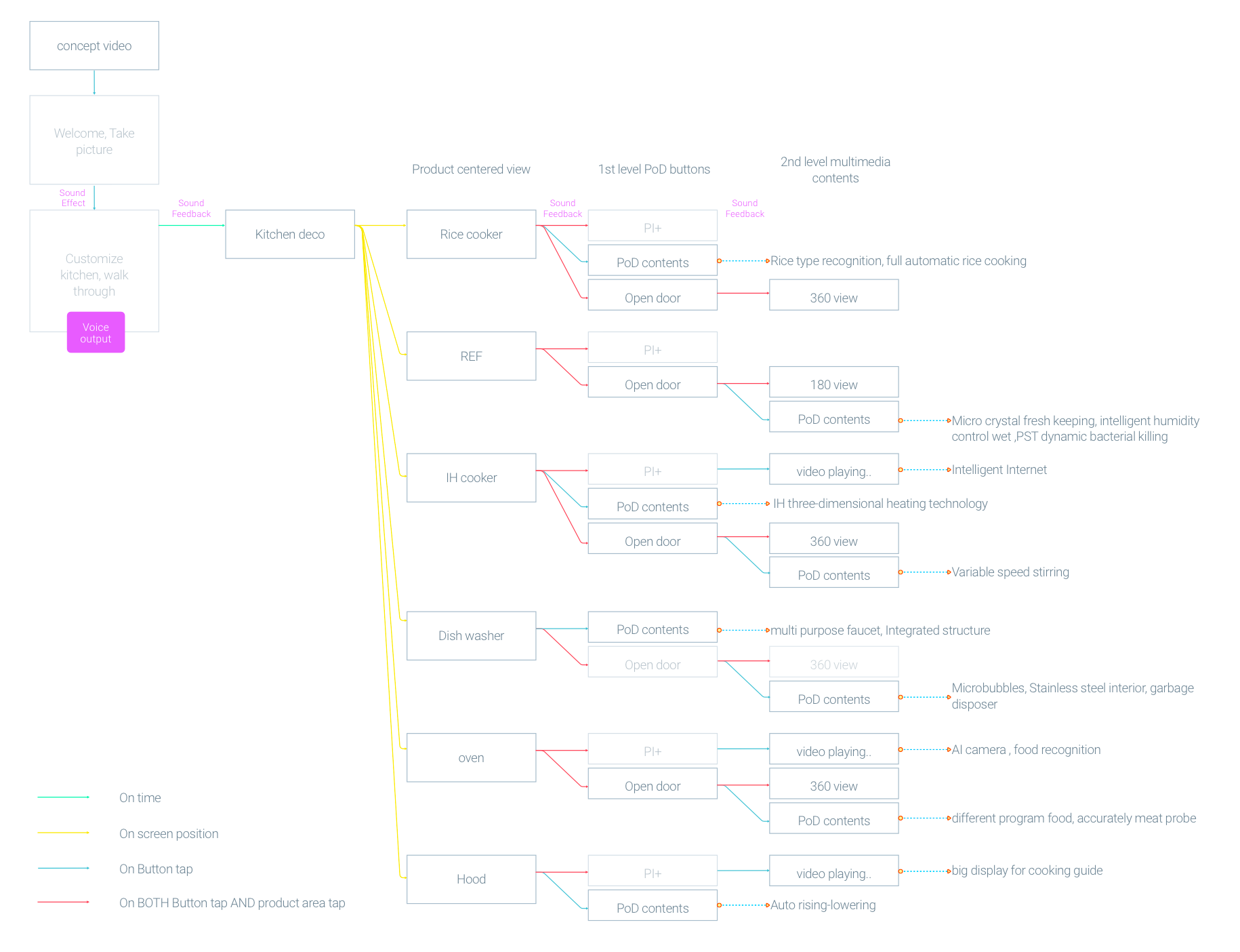
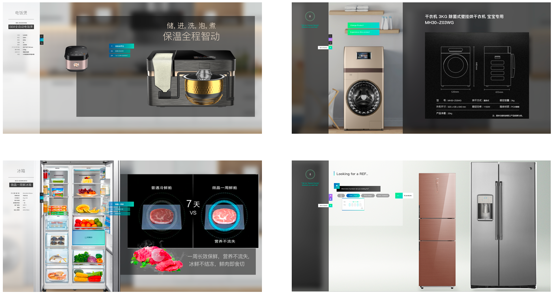
Contents map
Six categories of products have differences in size, usage, complexity.
For a successful collaboration, I summarized all visual contents to be on the screen.
It also worked as a detail development plan document.
For a successful collaboration, I summarized all visual contents to be on the screen.
It also worked as a detail development plan document.
Screen UI
Ergonomic design
For a big screen design, it was important to understand the position and size principles,
as there is no proven norm of it.
as there is no proven norm of it.

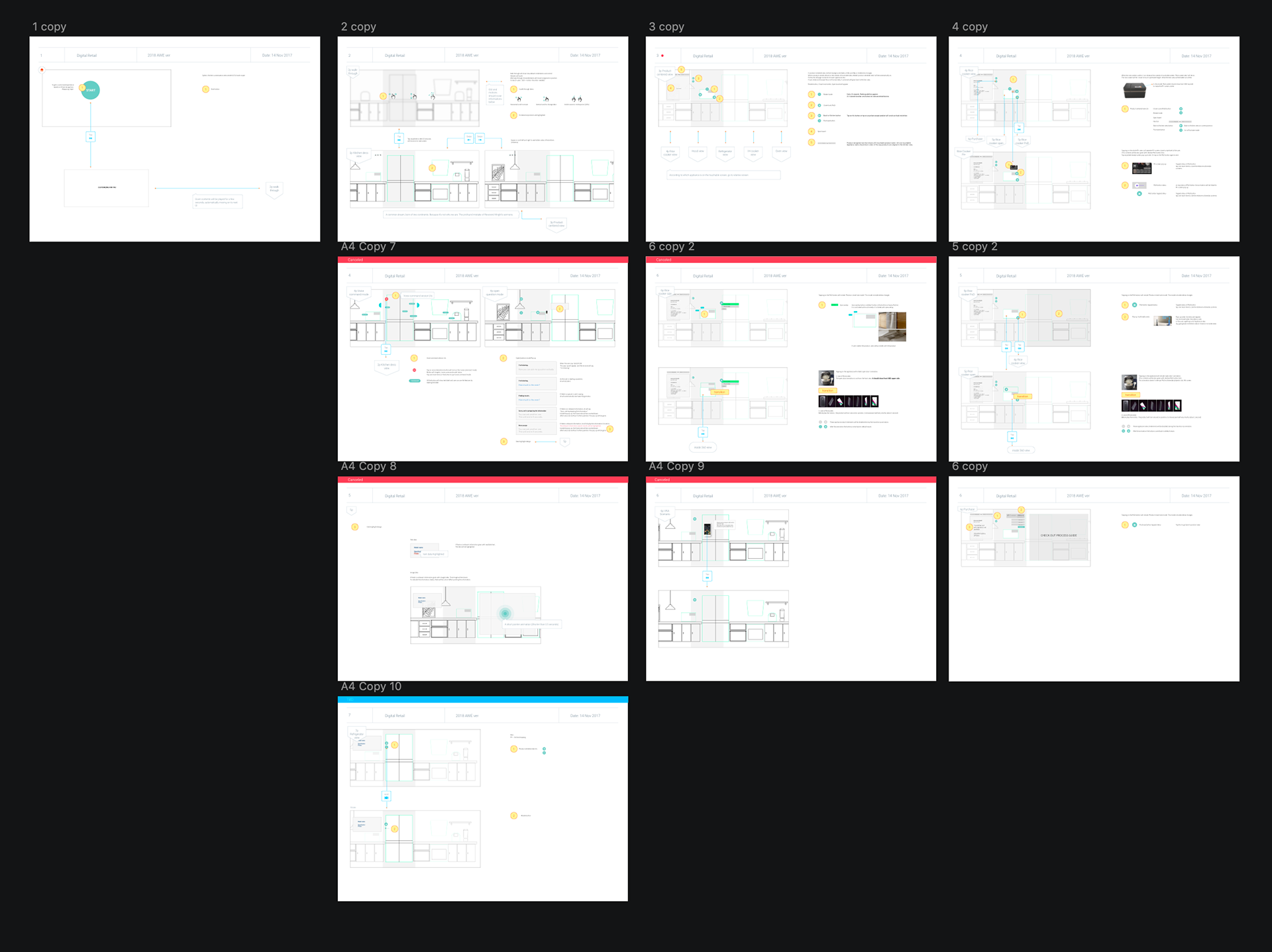
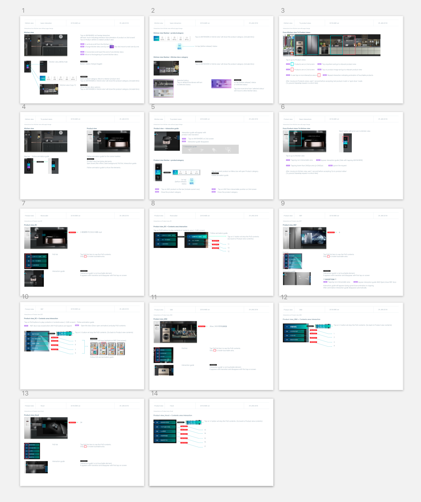
interaction spec & Wireframes
To kick off this multidisciplinary project, I shared an interaction spec based on verbal discussion with developers
It helps to collaborate better with developers as designers can tell what we can and cannot use.
It helps to collaborate better with developers as designers can tell what we can and cannot use.

Interaction spec & principles
Wireframes
Storyboard
Final look
The main focus on UI was to keep the experience immersive
1. Keep things alive
2. As little UI as possible (+ gesture control)
3. Contextual guide (interaction tutorial)
2. As little UI as possible (+ gesture control)
3. Contextual guide (interaction tutorial)
Details with life
Touch Gesture control
Guided interface
visual elements
Real size living environments


Voice UI
modulized elements help both designers and developers to fulfill the experience requirements, meanwhile, flexibly try various solutions for limits and creativity
Final design output
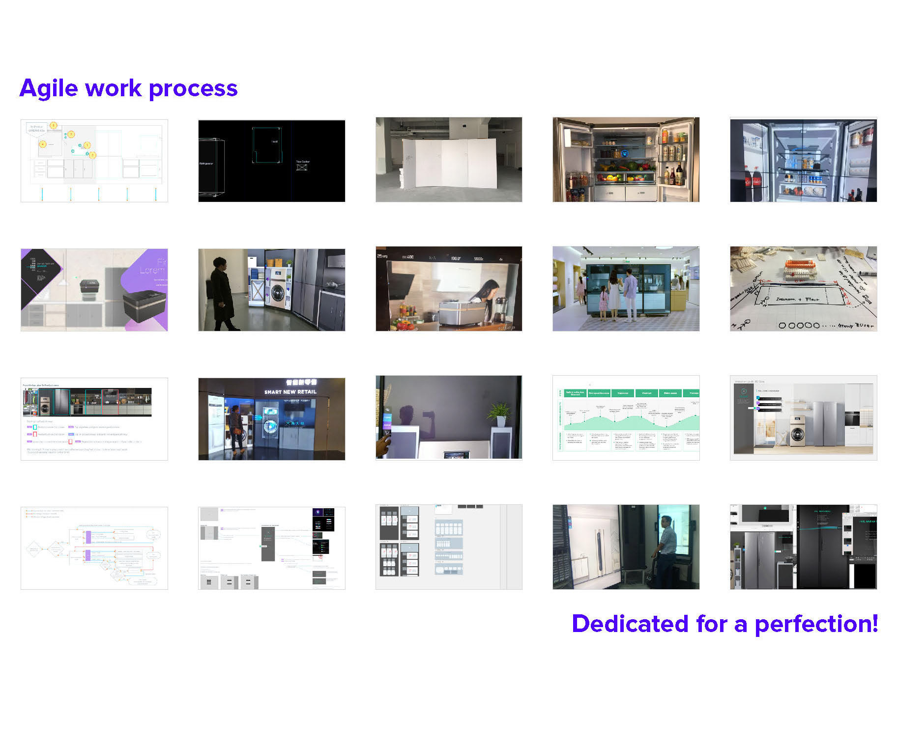
Exhibition & Process
Thanks for reading!

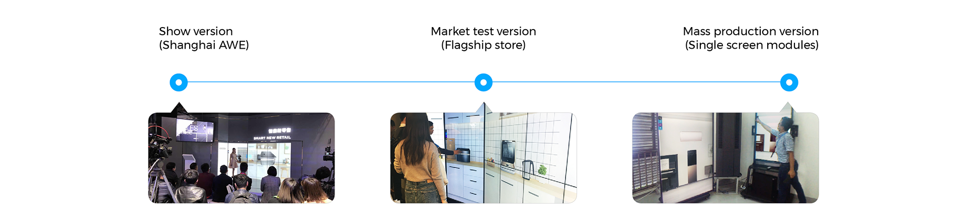
2018 AWE shanghai show