UX&UI proposal for a REF screen interface.
This is how I built up initial lo-fi interaction concepts.
This is how I built up initial lo-fi interaction concepts.
Define challenge
From research, we found users have problems with navigation.
And more than 80% of users answered they won't pay more for the smart features.
And more than 80% of users answered they won't pay more for the smart features.
By re-defining the information hierarchy and the way it shows, we could solve the issue.
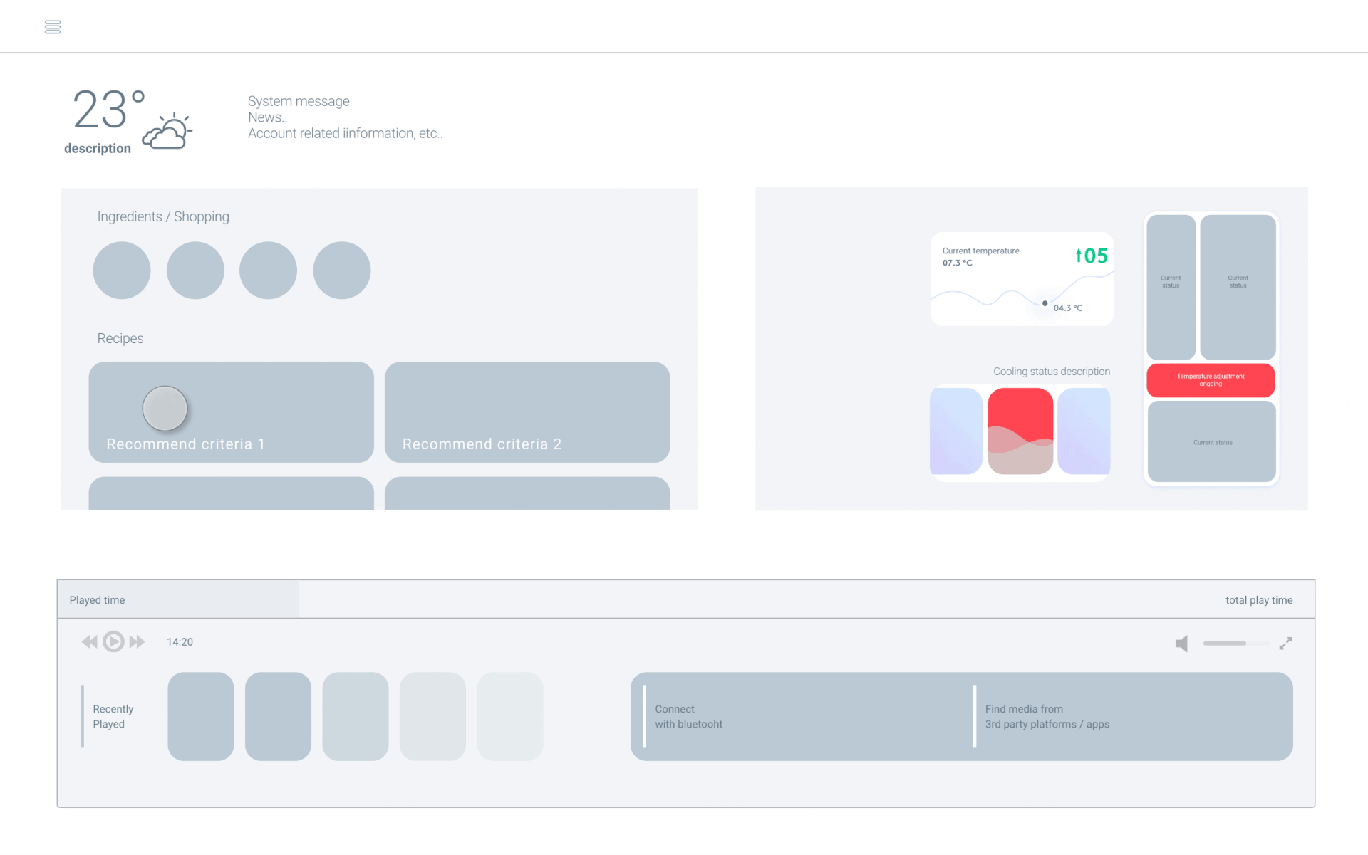
This is one of lo-fi prototypes I made in the process.
Information architecture

Basic architecture is built to help users easily understand and access key features
Features were selected and re-arranged according to below criteria
Features were selected and re-arranged according to below criteria
- GNB -
- Optional Informations -
- Key values -
most used features
Brand value & product USP
Killer feature (wow factor)
most used features
Brand value & product USP
Killer feature (wow factor)
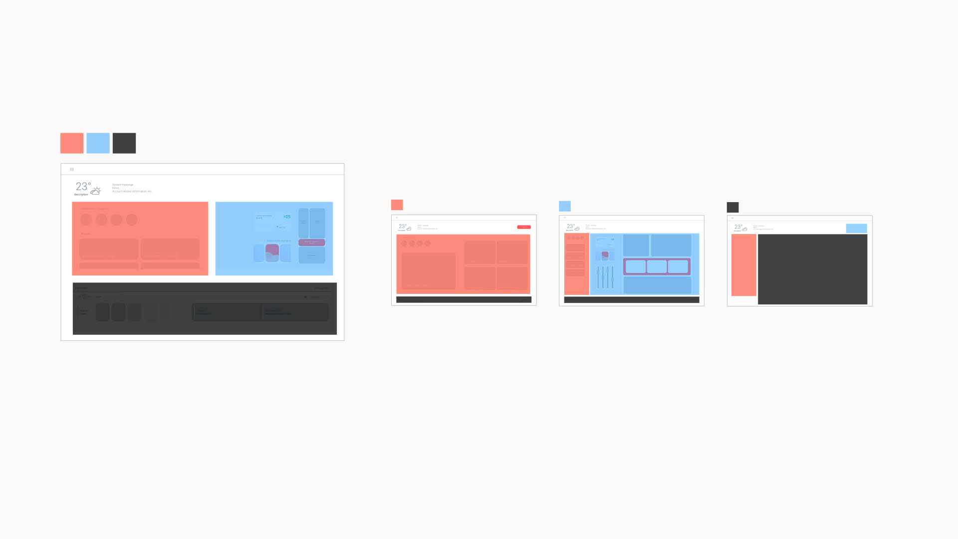
Layout

I calculated screen surface share of each section.
and placed them according to
and placed them according to
Interaction concept
lo-fi prototype
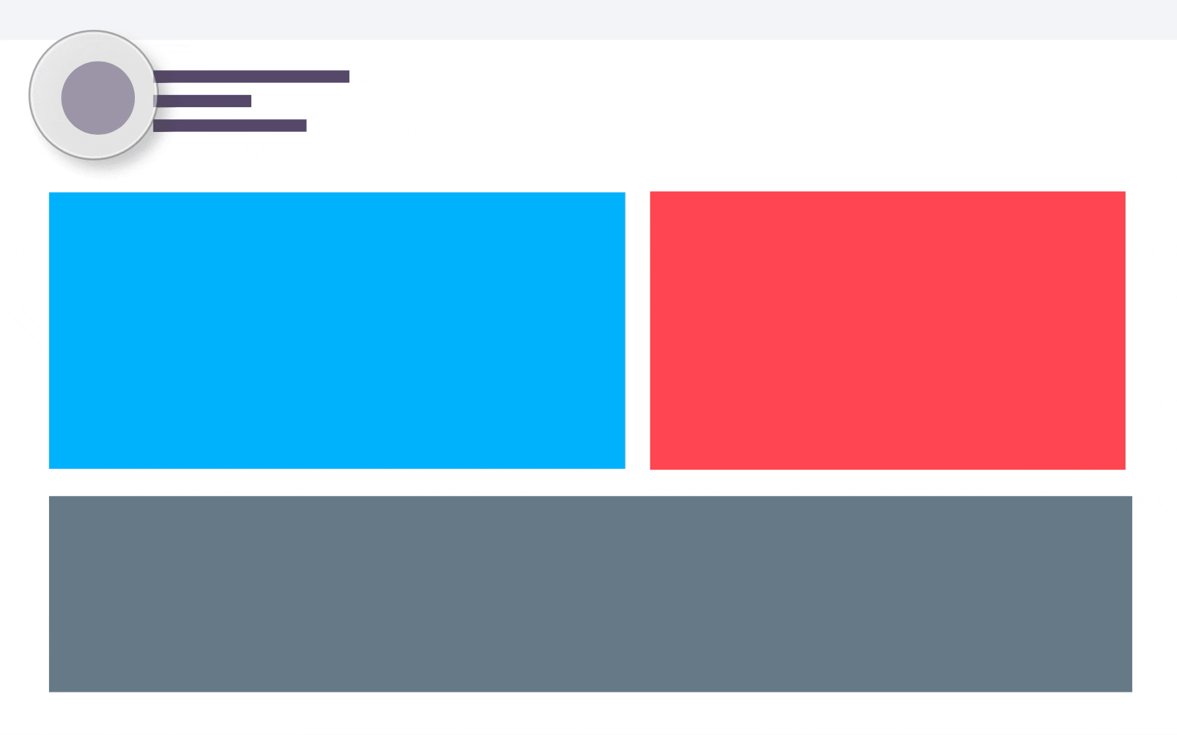
These key 3 features are directly accessible within one tap, wherever a user is.
And linear flow of UI motion is giving hint to users how to access features.
And linear flow of UI motion is giving hint to users how to access features.
Wireframe
hi-fi prototype