Media: Smart washing machine TFT screen (Android OS)
Year: 2018
My role: The whole proposal cycle from research, strategy, and design to prototype
Intro

In Midea, I was part of the Company Research Center R&D design team.
My project usually covered cross-category UX/UI strategy or concept products such as AI. 
This project was a unique case. We were requested by the Washing machine Business Unit (BU) to propose a graphic identity for the local premium proposition brand - Beverly.
The main challenge was to create a graphic that looks premium, but the BU designers are not UX expert, they were a missing priority and was not investing in improving usability. 
As a UX designer, I wanted to guide the team with usability principles as well throughout the proposal. 
Understanding 'premium' in Chinese market
Chinese market has a unique 'local premium' segment. 
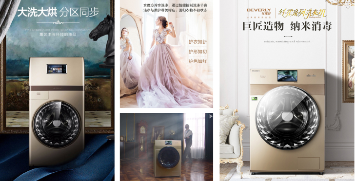
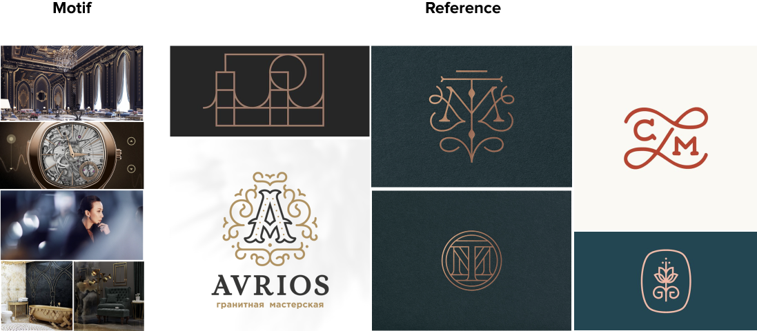
To understand this market, you need to understand post 60-70 generation, one of the main premium products consumers in China. They want to have the same experience for the home appliances, 'the luxury home appliances' as a fashion. Some of the common characteristic of these brand is golden CMF, full touch screen, use of purple and gold color in e-commerce graphics.

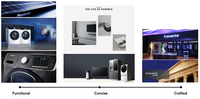
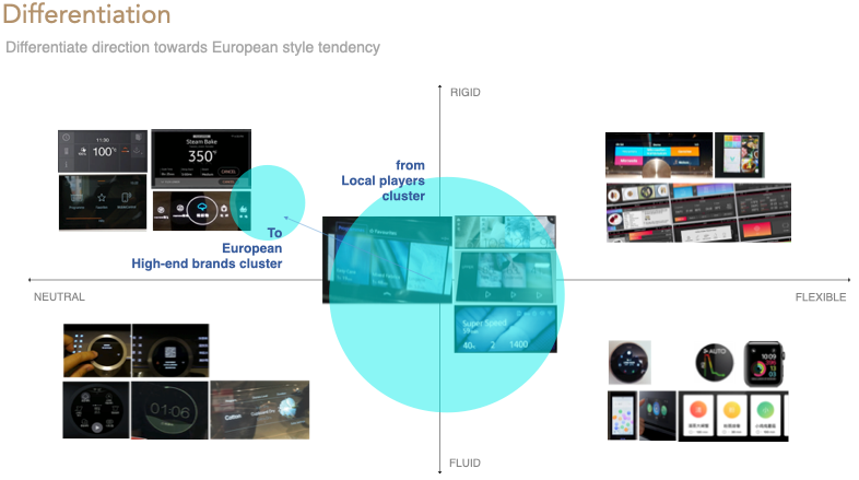
Premium proposition in globar market VS Chinese market

Analysis of The brand - Beverly

Beverly's idea of luxury is 'Elegance' which symbolizes the beauty of women above middle age. The washing machine business unit also explained, that 'elegance' is coming from a movement or a flow. For the industrial designs. they wanted to make a washing machine that every moment of your washing stays elegant, which is another way of putting ergonomic design. 
From the brief, I also wanted to create that represent the seamless beauty along with the crafted experience, luxury of home appliances.
Now that we understood the brand, now it's time to study the TFT screen interface in general. 
Pre-project alignment
Together with UX researchers, we conducted market research and consumer interview to define challenges and opportunities. We found out the local brands were using macro images of various fabrics, water or bubble. It makes sense since it's all intuitively explains the washing, but the usage of images are slowing down the performance and lower the UI readability. We could tell the current style is made to be seen, but less to be used. 

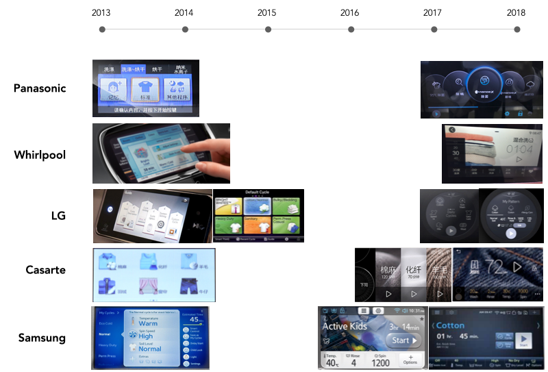
It has been only 5 years since the first generation TFT interface debuted on market, and it already went outdated.

Another thing we found out was that last one or two years many brands released the new UI/GUI, which is only 5 years after the first generation. The trend in graphic has shifted a lot but the lifecycle of the washing machine is much longer than that. For users perspective, they will spend much longer time with outdated UI/GUI if we're keeping current creative direction. ​​​​​​​
We wanted to head to drive towards the UI style which is more performance optimized, already common in the European high-end brands. In short, the new design will use digital native UI style that uses vector elements and layout that follows function. 
Heuristic Usability review
​​​​​​​1. Touch screen performance is lower than user's expectation
Many premium appliances are using TFT screen, but the irony is that they cannot afford high quality screen and memory. Compares to the experience from smart phone, it often give users feel like the software is slow and lagged.
2. Use of imagery is heavy on OS and easily go outdated
The market norm is using full size imagery, but they look old after 3-5 years already. Compares to how long the appliances should stay with users, it is a risky approach 
From the insight, I started to look for a way to convey the brand identity the best, yet using less imagery.

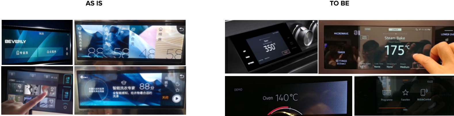
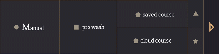
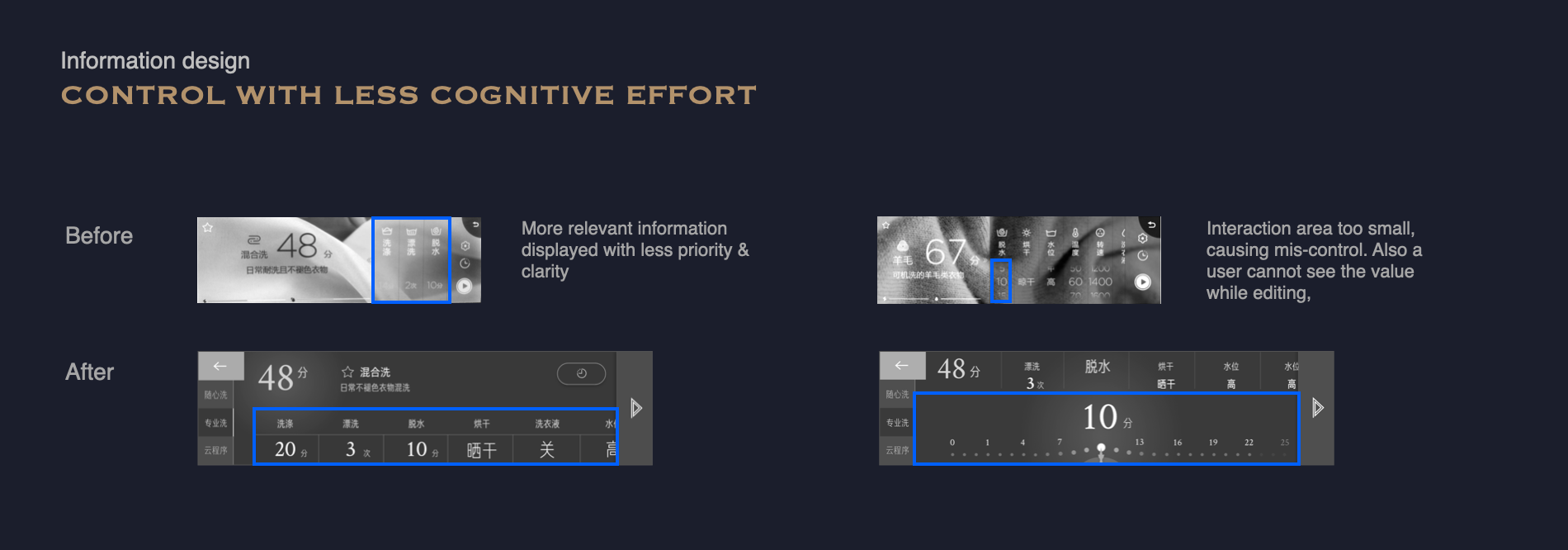
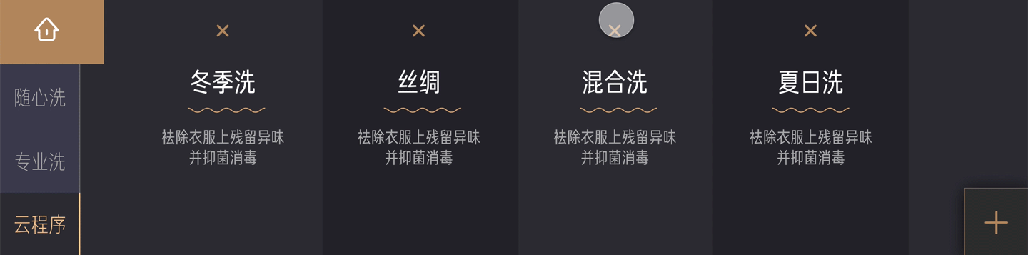
Low readability due to the complex BG and low contrast

Visually not aligned workflow

design Concept
Inspiration
I tried to define the visual motif of 'European' to create consistent graphic storytelling. The brand is referencing many European aristocratic lifestyles, but there was no context of a specific era or nationality. It felt like they were in the lack of understanding of what we're claiming to be.
Combining the Brand keyword 'Elegance' that comes from the flow and movement, I chose sleek and streamlined Art Nouveau / Art Deco as the motif. I collected modern graphic examples inspired by the era. After some trials and experiments, we came up with a style that is simple and geometric with a little tweak at the end as the key graphic creative.
The first concept definition

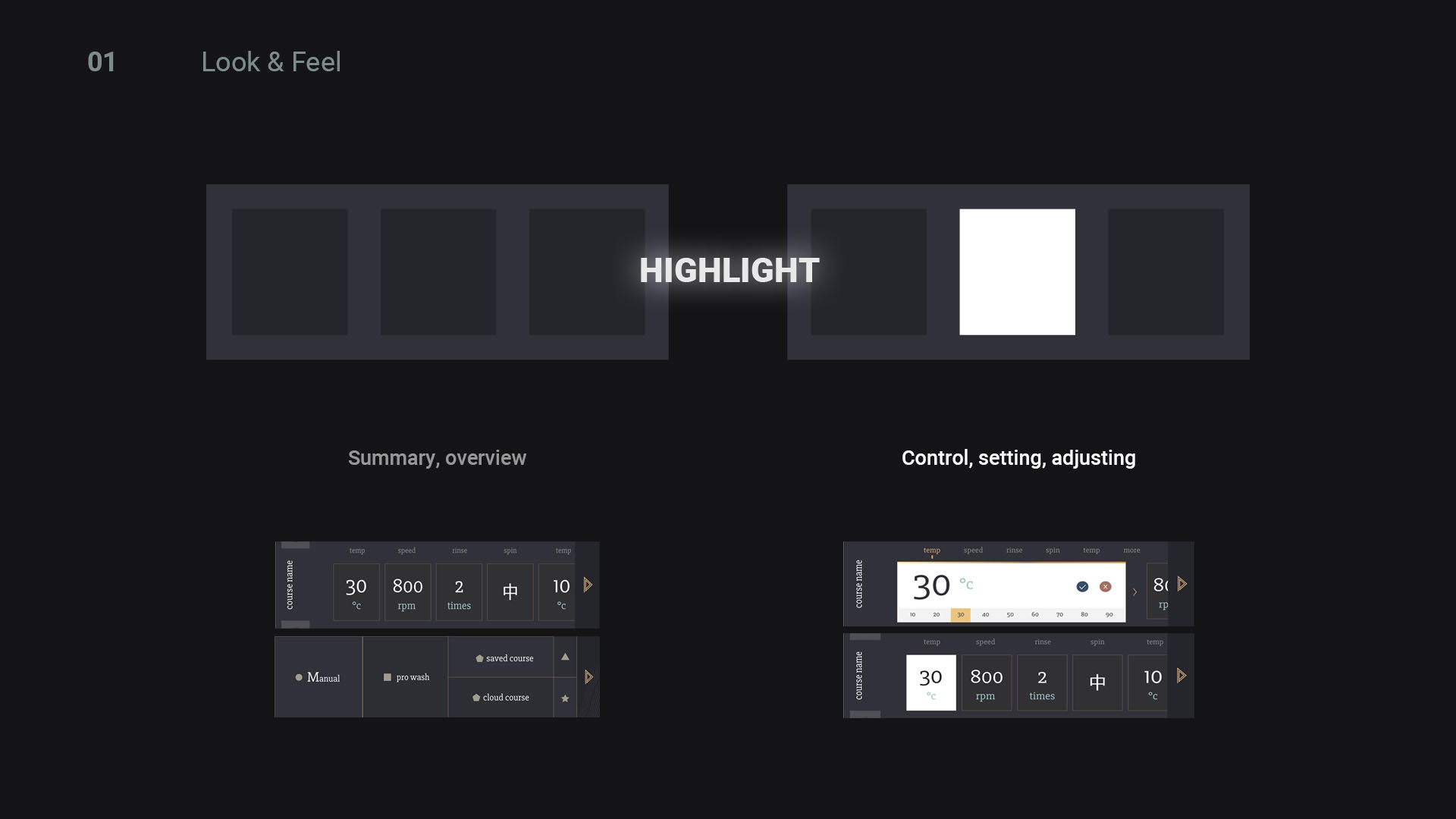
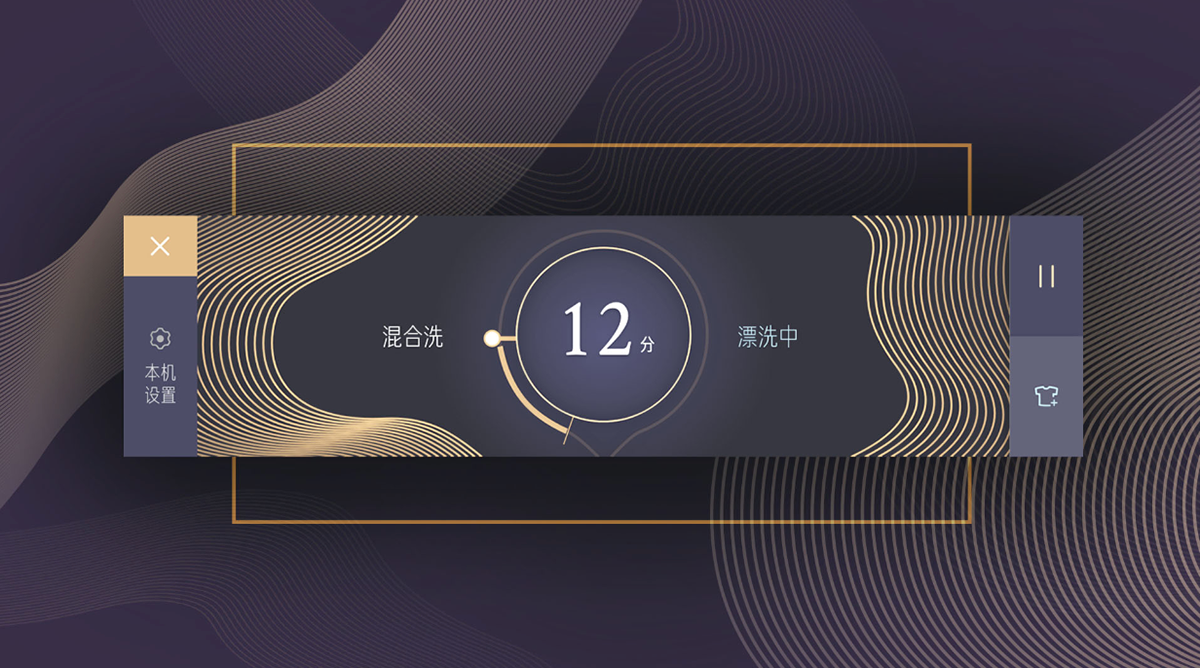
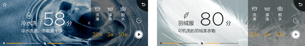
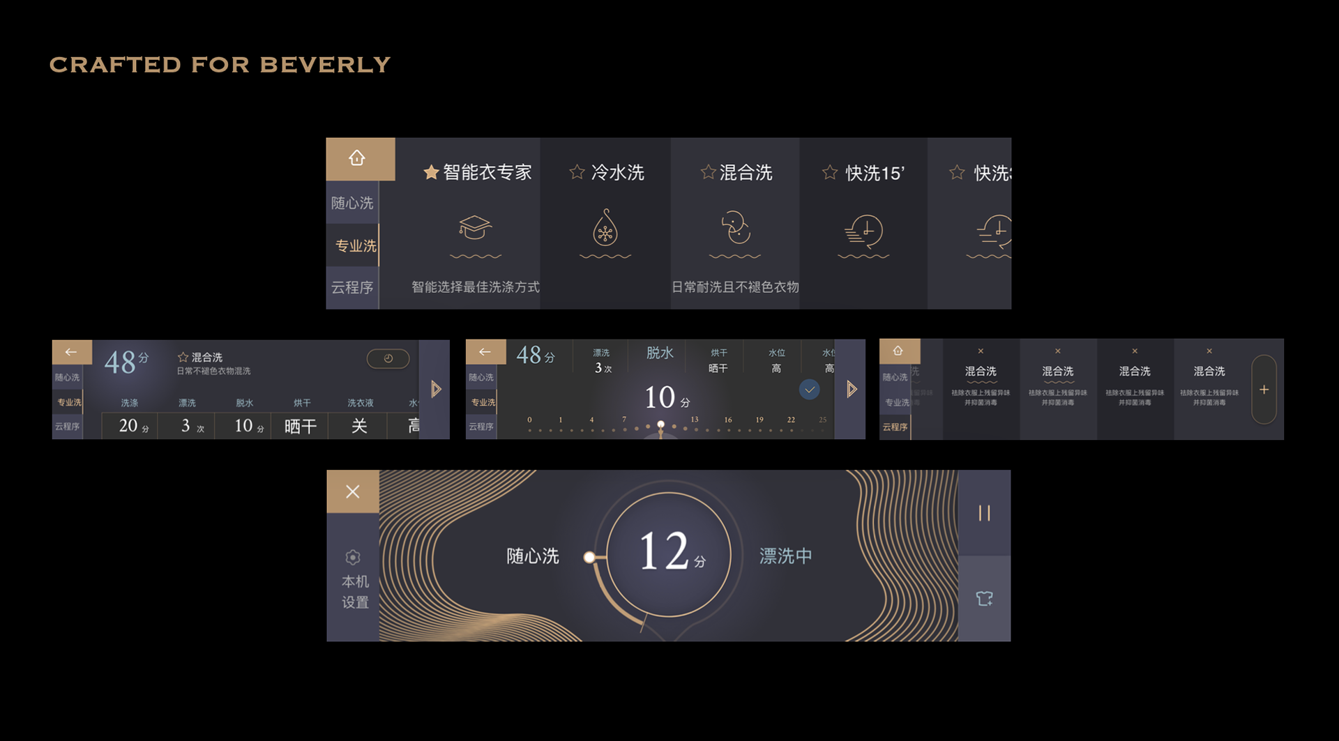
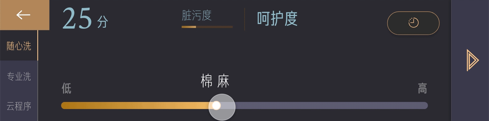
A design that naturally guides your eyes to where the attention is needed, with the contrast.

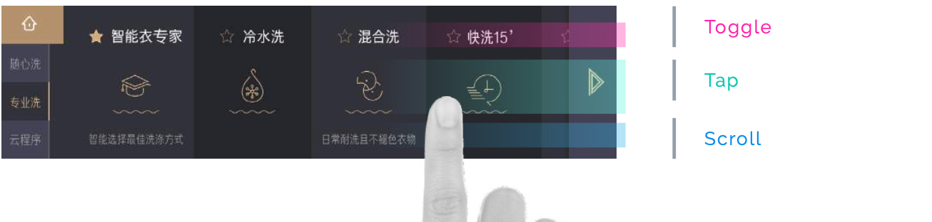
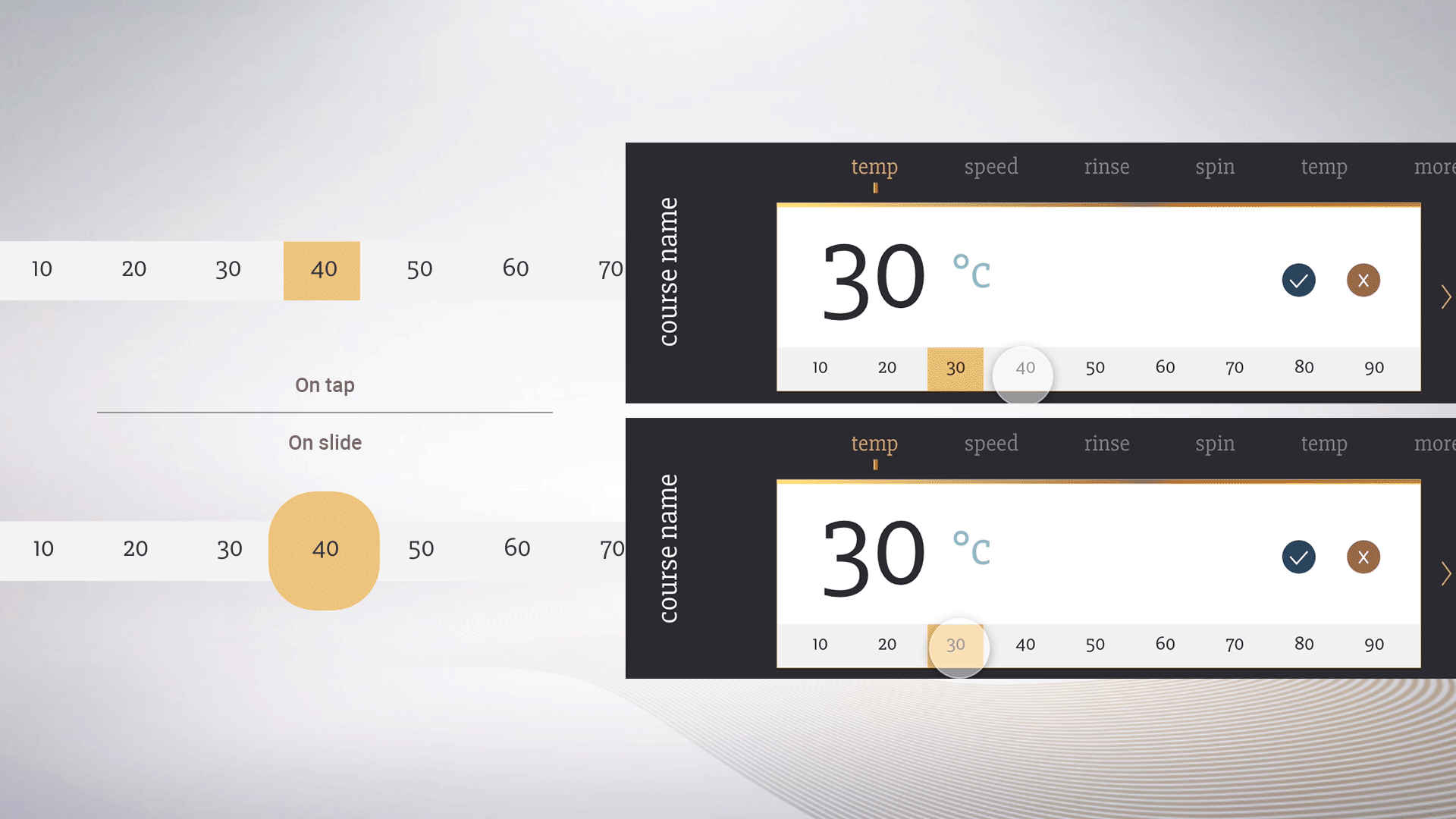
Crafted button behavior - a button can do more than one action, that makes sense with the user moment.

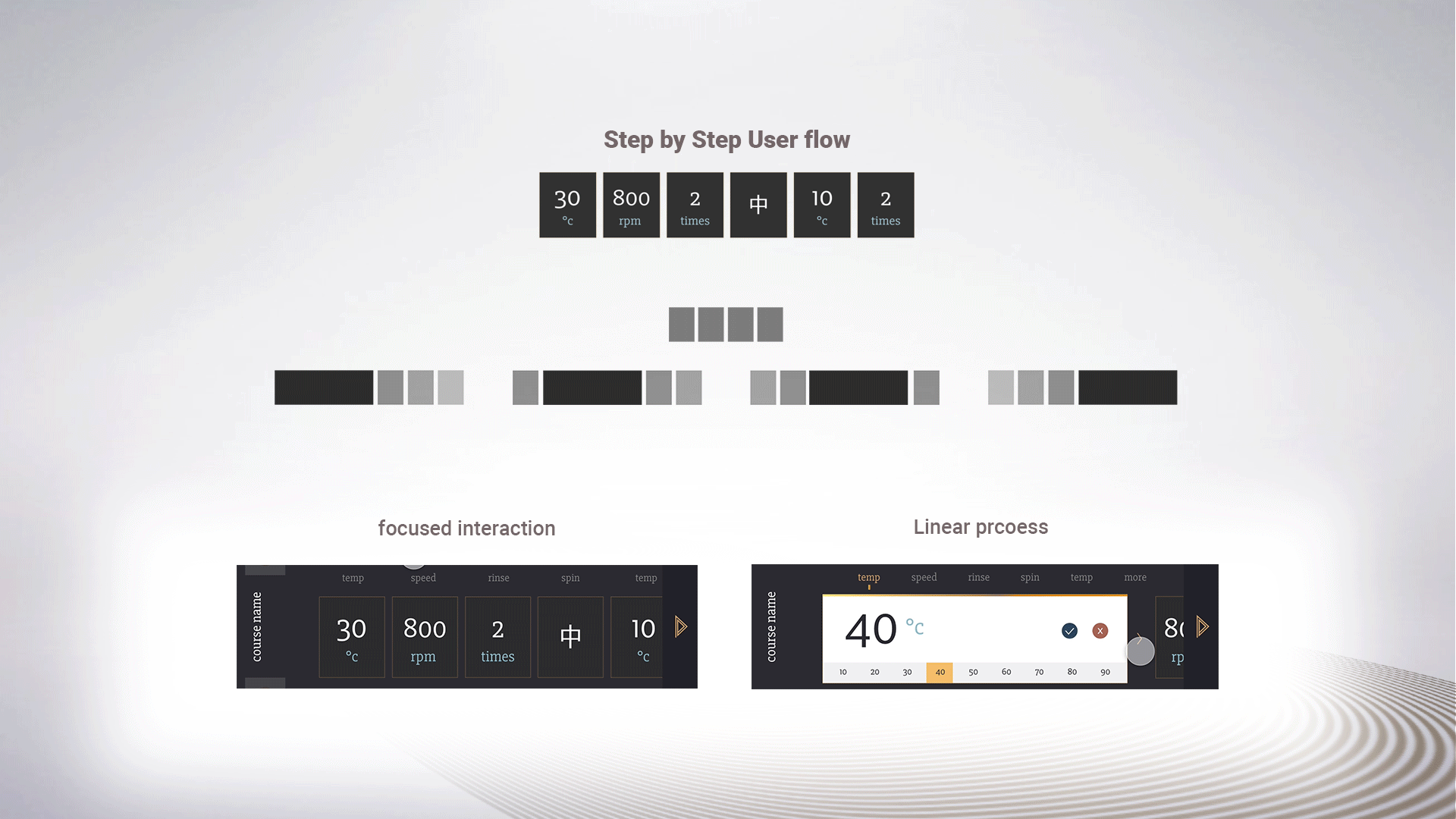
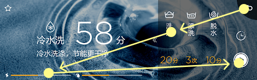
Animation is designed to help users understand the navigation structure by expanding cards and scroll action.

GUI exploration
The key request from the BU was a unique style as much as the improved UX. So we tried some concepts that can best radiate the 'luxurious' character the brand pursues.
Initially, I tried hundreds of graphic explorations which was a bit crazy.
The BU design lead picked this design draft and he mentioned the use of golden line, fluidity-elegance, and European-crafted classic feeling is perfect for the brand. Thus the 2nd round was diverging into all possible variation of the style. 
From variations, we could agree on the preferred color palette by the BU design lead.
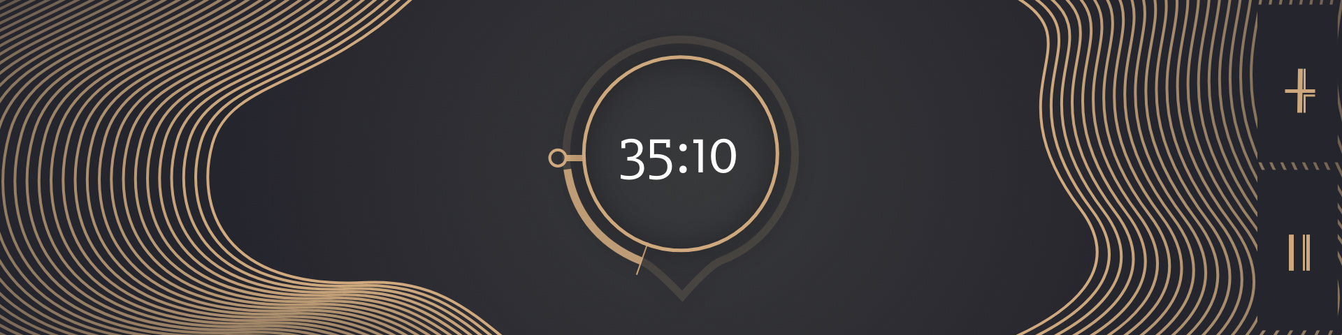
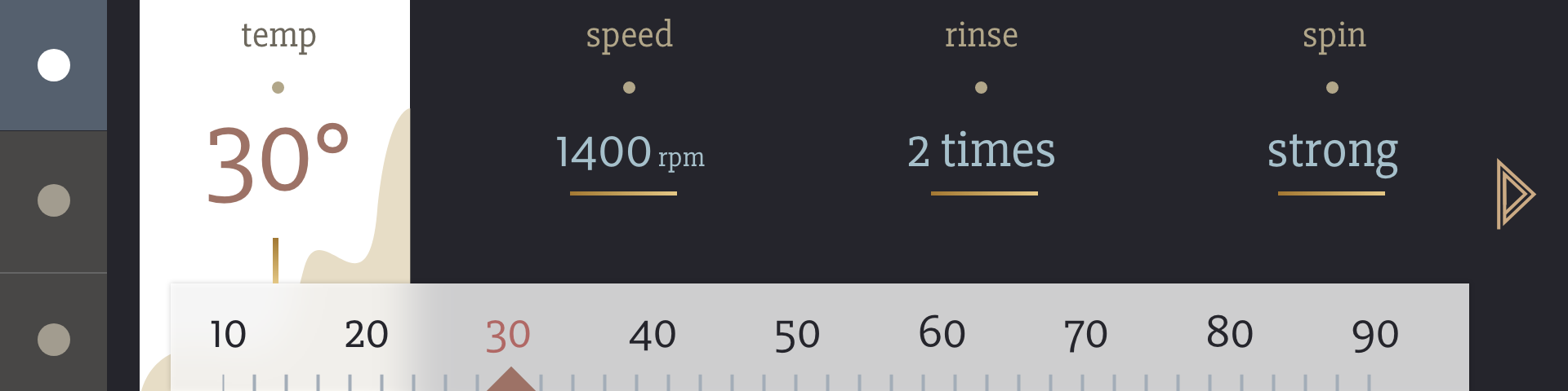
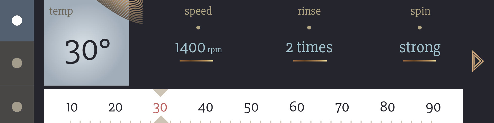
Mix of purple-grey and gold brown. 
From here it became challenging to converge into the final draft. There were 5 designers - all manager/director level and meetings always turned into ideation sessions rather than decision-making sessions.
Participatory design workshop
The situation led me to an interesting workshop idea. I created designs for each key flow, covering all possible design detail variations. I printed them on real-size glossy paper. 
Starting with my proposals, if anyone comes up with an idea, I find a similar design that I pre-created and asked the stakeholders to compare and share their feeling, and audit on pros and cons according to their expertise. At the end of the session, we find a final selection of preferred designs by the team.  

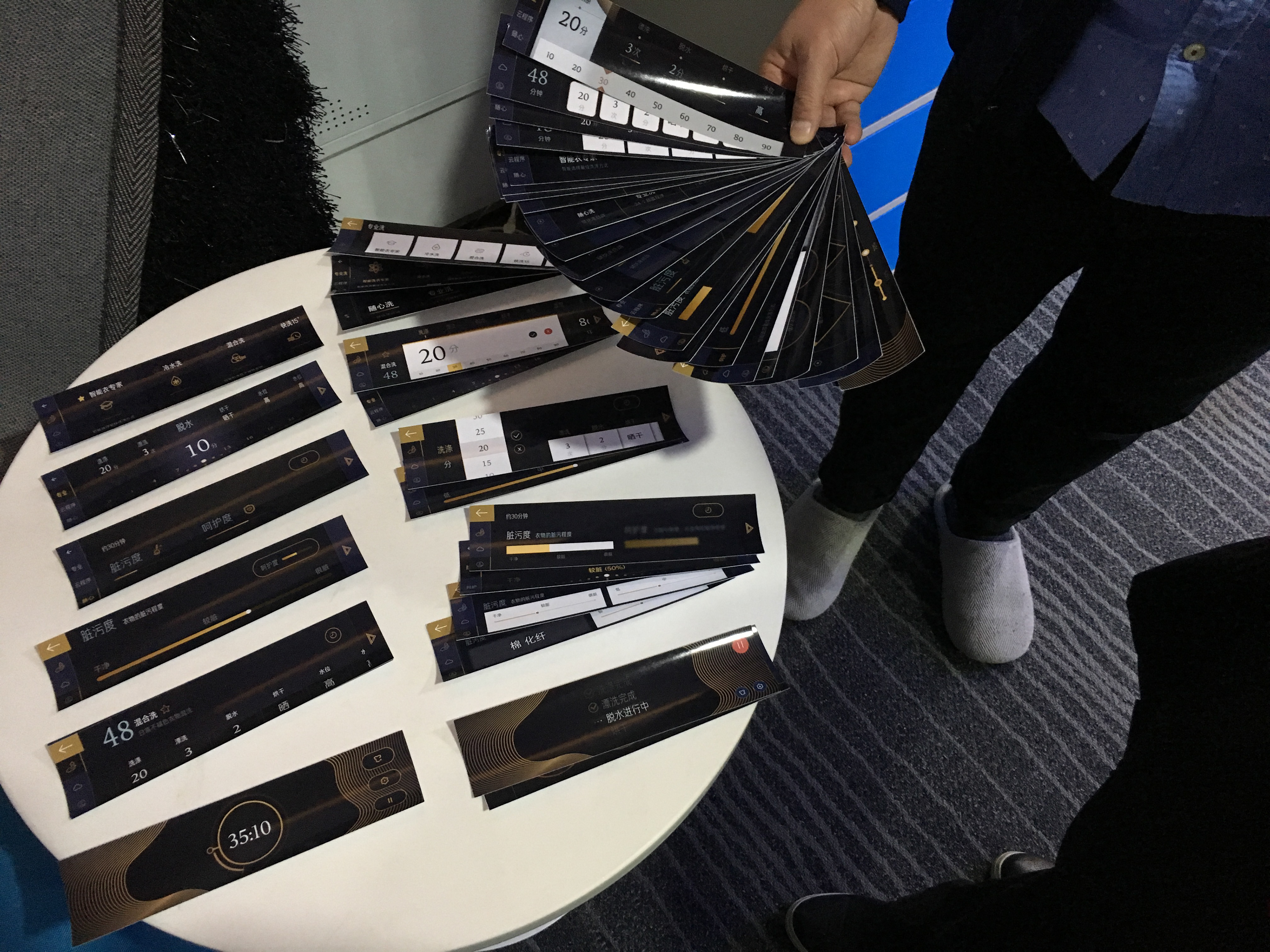
Design cards created for a decision making workshop

Iconography
The icons will be the main graphic elements replacing imagery. So icons for this project were not only for communication but also for branding. After some experiments, I came up with the below set with details added on corners and edges.
Responsive icons

These were designed based on the existing icon set.  They will be used only when we need icons as a replacement for imagery, in other cases, we will use an existing simple set of icons. 
Improved usability
The final version follows the principle of making the design clear, and readable. A part of my goal was to educate the stakeholders on what is 'good design rather than 'pretty design' - even thous I was asked for a 'pretty design'. I tried to make the improvement measurable. 
UI/UX
Beverly washing machine has two ways to adjust the setting values. First is their USP called 'smart wash' a user can simply set how dirty and delicate the laundry is, and the washing machine will automatically find the best setting for it. The second is preset wash courses, with extra cloud courses user can download from seasonal updates. 
Wireframe
Wireframe was created to see the overview of the functions and use flow.
screen architecture
Not like application design, which normally comes with guidelines from OS, GUI design for home appliances needs proper composition according to the screen ratio. For this case washing machine, BU wanted to use a new screen ratio that is extra wide. 

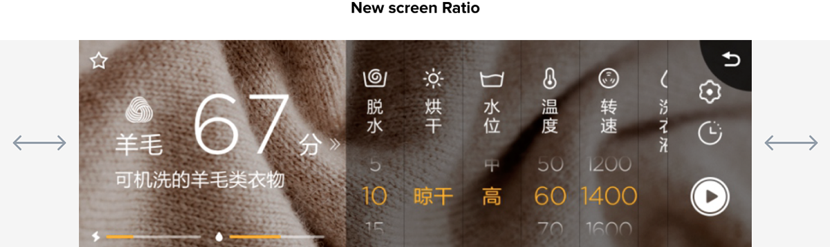
The new ratio was horizontally extra extended compared to the previous design.

To create a visually balanced screen composition from this ratio, I tried to find a pixel perfect gird system that breaks down in to common graphic ratios in market.

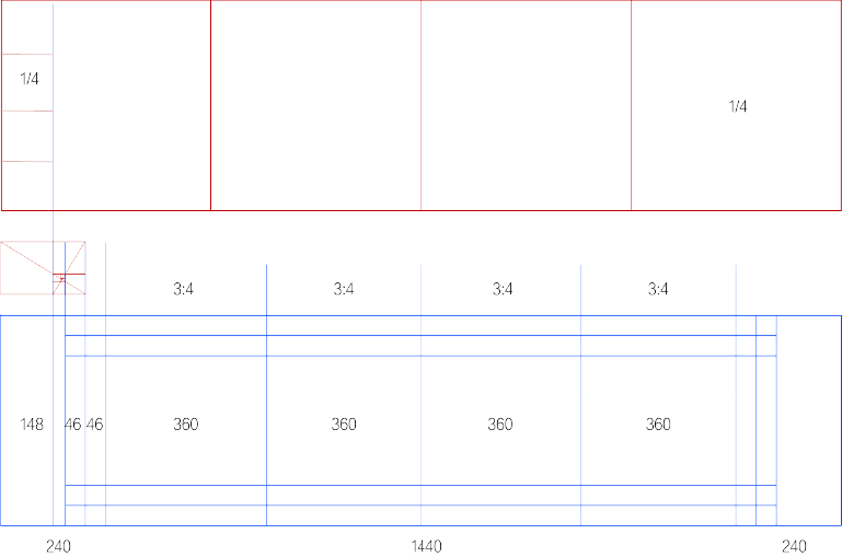
Grid guideline for the new screen ratio

Since we have limited usage of vertical spacing, UI design was mostly using horizontal scrolls only. I put fixed navigation on the left and operation on right. So that the user workflow will always follow the eye from left to right

Design mapped with cognitive flow

Also, avoid your finger covering the information during the control. Tappable elements are assigned on the bottom and informative elements are assigned on the top. Instead of having mixed composition per card, the idea was to see the whole screen as one building with a floor plan.​​​​​​​

Design structured for ergonomic usage

Prototype Micro UX
Review
Overall, the project was well received, I had many internal presentation&sharing introducing this project. 
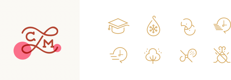
The idea of the responsive icon was the most popular part, we got another request from refrigerator BU asking for a similar solution approach for their premium proposition. 
Unfortunately, the design didn't go to production, because the whole project led by BU didn't make it to market. 
Back to Top