
MedIa: Product User Interface
Year: 2017-
My role: Research, UI spec ideation, Support GUI
PROCESS
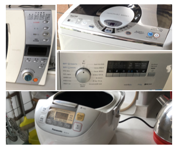
Pictures collected from user home visits
User issues
We found from the annual user visiting session, that users are facing interface pollution.
These products are made to communicate all their functions from the first depth, which makes the interfaces less intuitive, less aesthetic.
Business Aspect
Low cost is no.1 sales factor, especially for the mass market segment.
Higher spec display units can make interface simpler by hiding not necessary functions at the beginning, But many products try the approach with TFT screen has failed because the product was more expensive, and obviously the consumers didn't find the value is worth of it.
2nd thing we needed to consider was the ID (Industrial design)
Company design center has clear vision on flat surface products. We wanted to make our products more and more like furnitures, instead of a machine with hundreds of buttons.
Company design center has clear vision on flat surface products. We wanted to make our products more and more like furnitures, instead of a machine with hundreds of buttons.
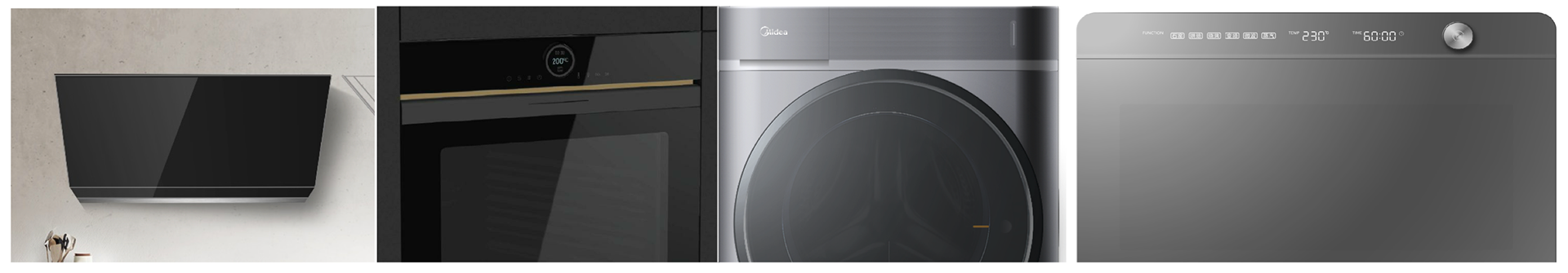
Mass market product design tendency
Understanding that PUI is playing a part of holistic product experience,
it should consider being harmonized with the product.
it should consider being harmonized with the product.
Deisng/tech trends
So we turned our head towards emerging display solutions
that offer graphic flexibility but still at a competitive price.
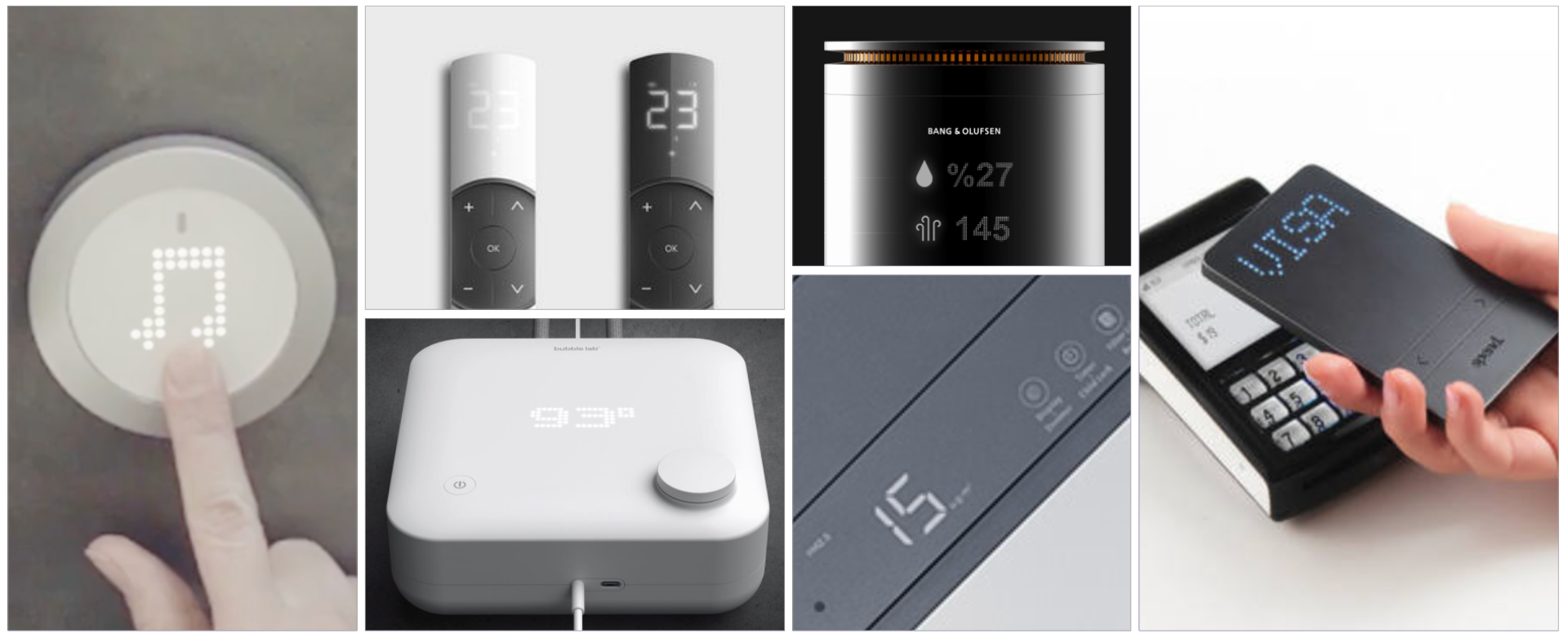
Desk research : Dot-type LED was found in many emerging products
Field research : Soft & Hidden CMF trend found in AWE Shanghai 2019
PUI proposal
Zero-interface seamless hidden control panel
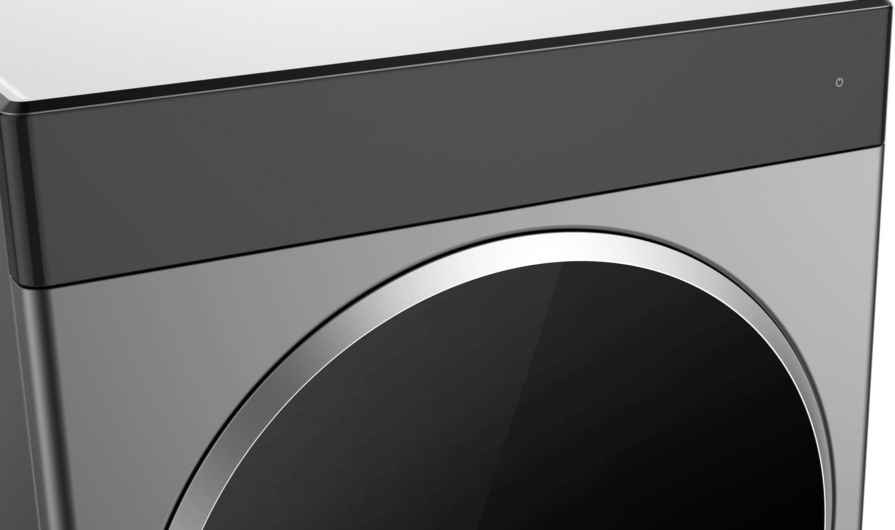
Invisible interface turn on effect
Approach
The proposal was focusing on universal solution that can be applied to all major products of Midea business units. From both the ID designers and users side, we heard the feedbacks that the current platform is too complicated.

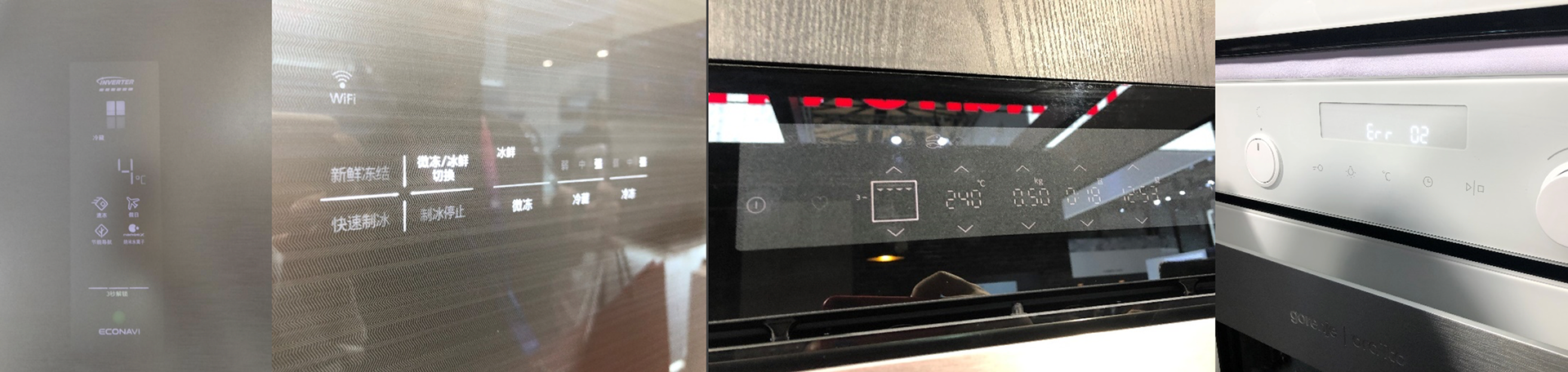
Current platform
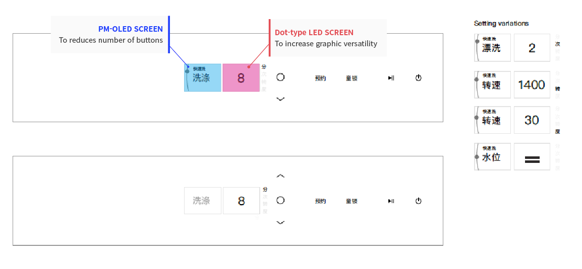
The goal is to reduce the number of buttons and LED lighting panels. Most common act to do this in the market was using OLED screen, and create step by step hierarchy in UI. So that not all the buttons should be displayed from the first depth. OLED is could be an easy solution but it is more expensive.
UI spec design
So we used PM-OLED (single color OLED, if you never heard of it) panel to make the contents dynamic, responsive yet keeping the lower cost. We used LED for repeating actions. such as up/down/confirm.
And then we created below layout that can cover all the control cases only with a small PM OLED screen, and the minimal number of LED unit.
Now it's time to play with styles using this layout.
EARLY proposals


From the early proposal we found the problem is because the PM-OLED screen is so small, we couldn't hight the number big and light enough. Our challenge was to hight the numbers without loosing identity and visibility.
Screens with dot-type led

Selecting course

Course details

Editing the details
That's how we came up with this final design, with dot-type LED number unit as a center piece, combined with PM-OLED information unit and LED control unit. It is lower on cost but better on visibility, with a look that represent the company's vision.