Keep adding & collecting UX details from random surfing.
First access
Any service that tries to bring solutions on-line needs to think about 'first access' situation, where users are clueless, left with the least knowledge.
Last time I was in an app project for a bank, and the objective was to provide users tools that have great future potential. One the users start to use it, it will help their life immediately and even greater in the future. The team created design mock-ups for every information filled, but it's equally important to think 'how to teach users' to be engaged with the service when they don't know that it's a useful service (or how to use it) in UX point of view
usability hub
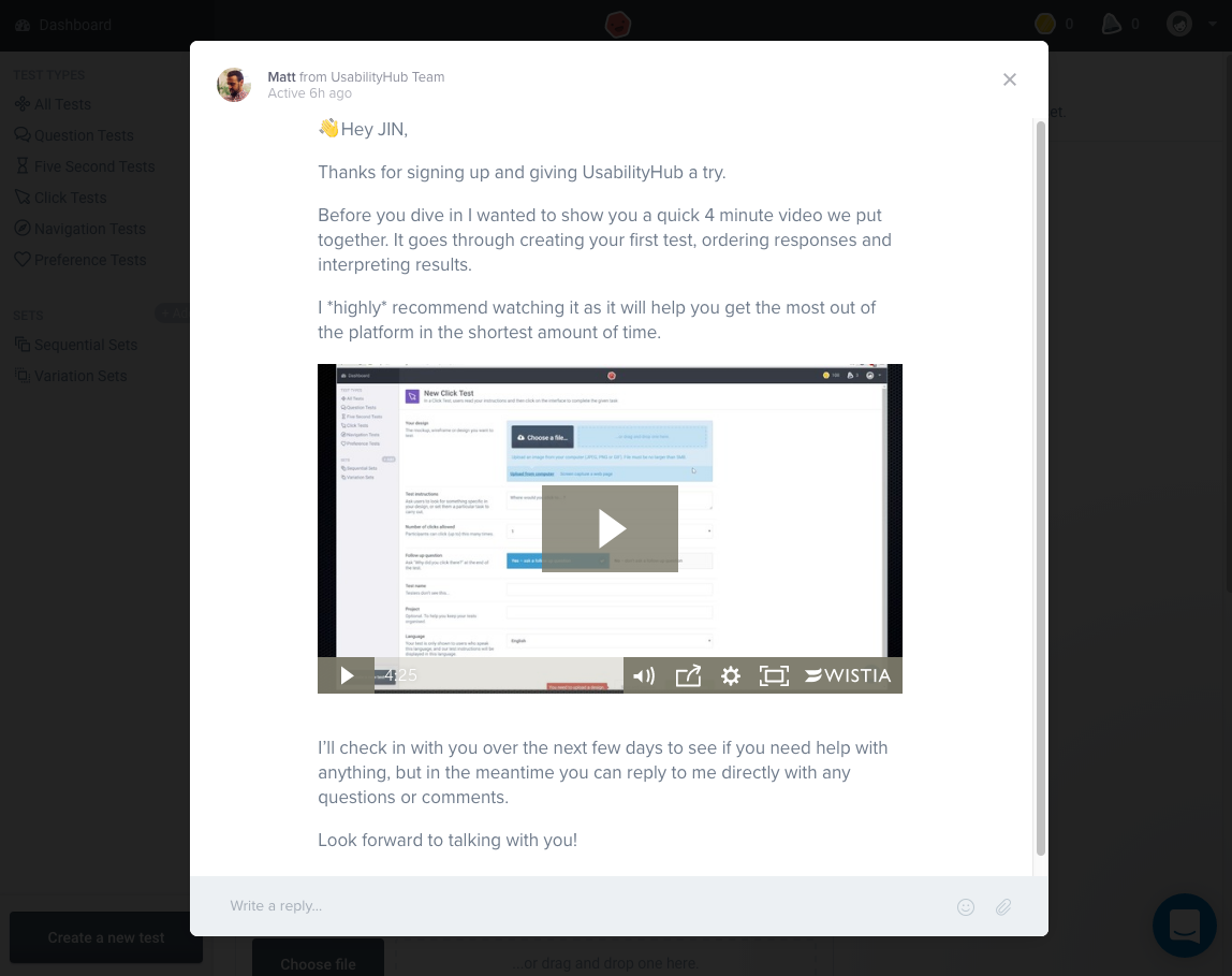
First access to Usability hub was a well-made experience. Not only they welcomed me with human language, the video was intuitive and easy to understand, triggered me enough to use the service. They send me emails a few times as they promised, and 'reply' feature is cohesively placed, just at a place that users will look for if they need, and won't bother users at all if they're not interested.
Slack
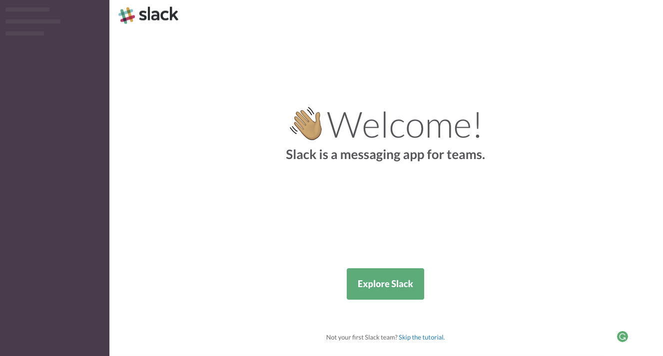
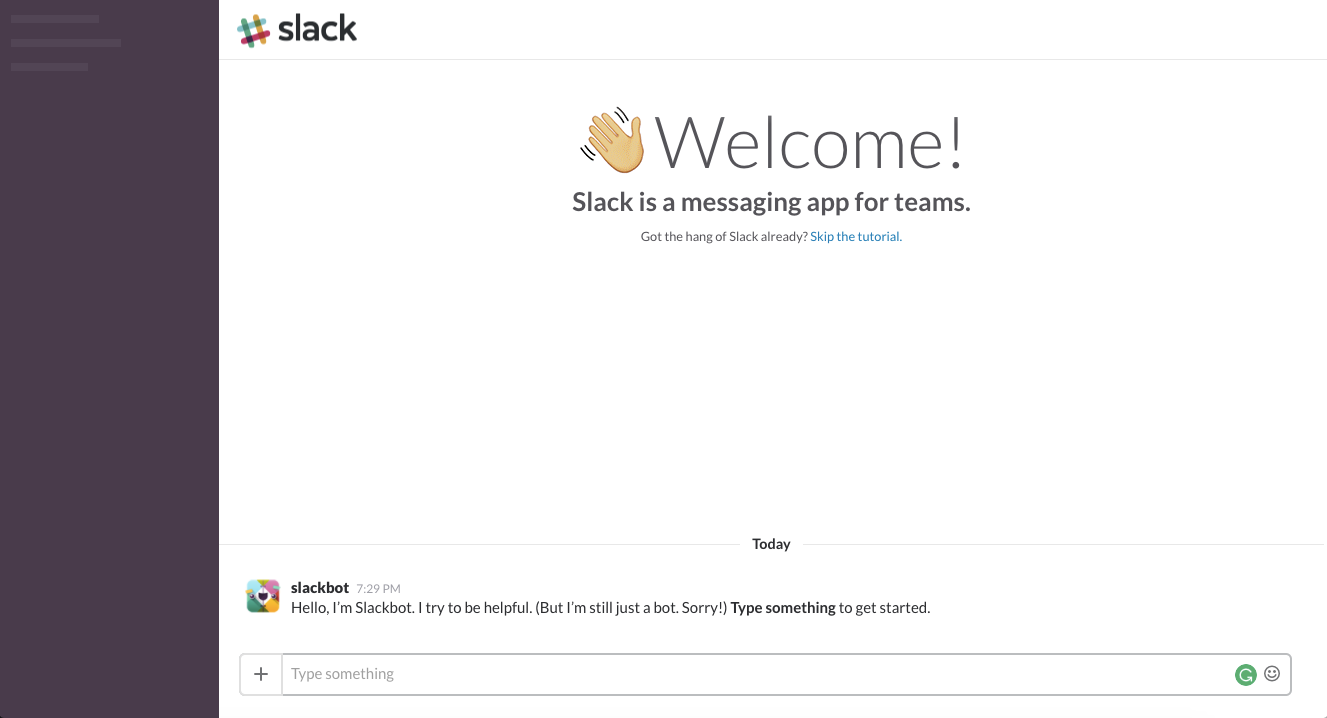
Slack also uses human language and linear tutorial, with interactive walk-through. But as a practical user, I preferred usability hub's 'one page serve it all' system.
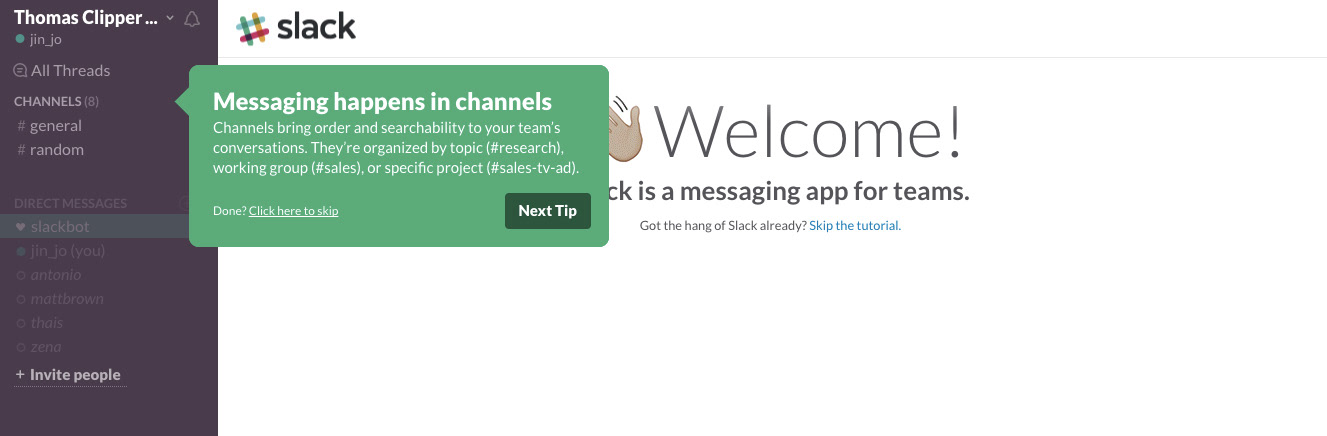
Slack used step by step interactions that users can follow, which I would never have done if it's not the famous slack.
I could enjoy it if it was like a game. In games, if I click those walk-throughs, they might prepare amazing demo that usually makes me feel so rewarded. In slack's case, the experience was broken, and I have to do a few clicks and 'go back's. that kind of made me feel tired.
(Still I think it's a good example)
Following feature bar
https://hbr.org/
sub menus sticking to a position as scrolls down, is nothing new. But in this 'Harvard Business Review' case, it's interesting that it's focusing on a good reading experience.

The menu bar is not consist with everyday random features, it’s serving professional readers. Their age & main usage is will reflected here.
At the very beginning, the bar is just sticking to top Y position, right below main nav bar, following the scroll.
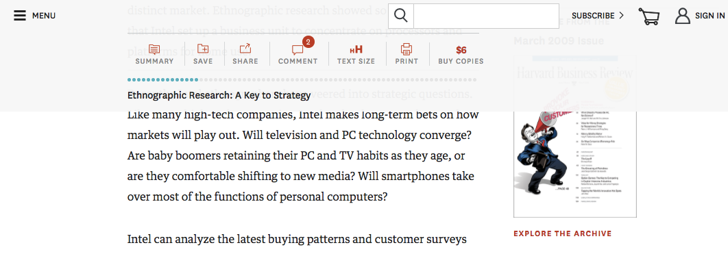
It was a pleasant surprise to know there is one more depth, that indicates the full length of the article, and where about I am reading. (blue dots on grey dots works as kind of progress bar for scroll)
foldable ad area
http://www.ces.tech/
'Close Advertisement' feature on the global menu.

- only the ads that are related to the site's purpose should come here. Otherwise, random ads will take the most visible KV area, and ruin the first impression of web experience.

After the interaction, of course, it changes to 'open advertisement'